Due to a computational error, the data and conclusions in this post may not be accurate.
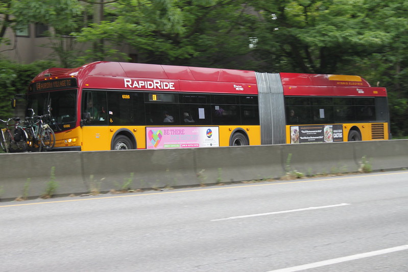
“KCM 6086 at Aurora & Galer” by SounderBruce is licensed under CC BY-SA 2.0.
The routes in this update of the access-based route productivity series all cross the Lake Washington Ship Canal using the Aurora Bridge. Routes 5, 28, and the E Line share a common path out of downtown Seattle, cross the bridge, and then diverge. They are much more straightforward than the routes in the last installment; they largely lack the intra-route variation, twists and turns, and overlaps of the previous batch. There is a longer version of route 28 that runs during peak commute times. Aside from that, these routes basically correspond to one sequence of stops, in contrast to the aforementioned route 3, and its mess of variants.
Another thing that differentiates these routes is that they are run with conventional buses, rather than the trolleybuses used on the routes1 that have been analyzed thus far. Overall, I think that vehicle type—referred to as “mode”—gets overblown in public transit planning. Planners associate different rider behaviors with mode, rather than characteristics like frequency or dedicated right of way. In some cases, the mode does influence that nature. There is a stark difference in the access-based route productivity measurements between this batch of routes and the previous ones, and perhaps something about the infrastructure that underpins them does play a role.
Route Journeys are the number of completed journeys2 in which the route is part of the fastest path between the origin and destination. Higher numbers are better, but I don’t consider this to be a useful measurement on its own. It’s a building block for other measurements.
| Route | Route Journeys (45 min) | Route | Route Journeys (30 min) | Route | Route Journeys (20 min) |
|---|---|---|---|---|---|
| E Line | 28,377,307,178 |
E Line | 6,292,756,511 |
E Line | 1,201,864,328 |
| 5 | 15,739,704,337 |
5 | 4,465,621,537 |
5 | 991,394,672 |
| 28 | 5,552,200,124 |
28 | 1,576,550,802 |
28 | 345,350,872 |
| 3 | 3,742,123,871 |
3 | 972,740,466 |
2 | 273,933,357 |
| 2 | 3,528,086,836 |
2 | 958,885,815 |
3 | 262,988,772 |
| 1 | 3,436,900,336 |
4 | 774,856,324 |
4 | 206,374,589 |
| 4 | 2,908,369,843 |
1 | 700,897,422 |
1 | 172,353,188 |
| 13 | 1,729,648,532 |
13 | 415,950,524 |
13 | 118,378,786 |
The Journeys per In-Service Second account for these routes having varying in-service time. Higher is better.
| Route | Journeys/In-Service Second (45 min) | Route | Journeys/In-Service Second (30 min) | Route | Journeys/In-Service Second (20 min) |
|---|---|---|---|---|---|
| 5 | 41,403 |
5 | 11,747 |
5 | 2,608 |
| 28 | 39,818 |
28 | 11,306 |
28 | 2,477 |
| E Line | 39,533 |
E Line | 8,767 |
E Line | 1,674 |
| 1 | 16,862 |
1 | 3,439 |
1 | 846 |
| 4 | 11,448 |
4 | 3,050 |
4 | 812 |
| 13 | 10,677 |
2 | 2,643 |
2 | 755 |
| 2 | 9,726 |
13 | 2,568 |
13 | 731 |
| 3 | 9,655 |
3 | 2,510 |
3 | 679 |
Replaceable Journeys are the number of journeys featuring a fastest path that includes the route, but still could be made within the time budget with that route eliminated. It can be made with a different combination of transit routes and walking. A lower number signifies higher performance, but, like the route journeys measurement, there is no accounting for the service investment. A route may have a lower number here not because it is inherently irreplaceable, but simply has fewer journeys to lose. Thus, I consider this to be another building block.
| Route | Replaceable Journeys (45 min) | Route | Replaceable Journeys (30 min) | Route | Replaceable Journeys (20 min) |
|---|---|---|---|---|---|
| 13 | 1,430,885,654 |
13 | 320,869,223 |
13 | 66,750,279 |
| 4 | 2,336,399,347 |
1 | 507,715,008 |
1 | 100,467,307 |
| 1 | 2,550,687,802 |
4 | 568,506,173 |
4 | 117,285,518 |
| 2 | 2,825,097,323 |
2 | 684,545,135 |
28 | 128,173,958 |
| 3 | 2,936,686,177 |
3 | 696,107,637 |
3 | 146,412,160 |
| 28 | 4,250,468,148 |
28 | 873,930,129 |
2 | 151,833,945 |
| 5 | 11,543,298,480 |
5 | 2,270,017,974 |
5 | 345,910,337 |
| E Line | 17,553,294,642 |
E Line | 2,726,596,110 |
E Line | 416,531,786 |
One way to account for the level of investment is to look at the replaceable journeys as a proportion of the route journeys. This is the Percent Replaceable. Lower is better.
| Route | % Replaceable (45 min) | Route | % Replaceable (30 min) | Route | % Replaceable (20 min) |
|---|---|---|---|---|---|
| E Line | 61.86% |
E Line | 43.33% |
E Line | 34.66% |
| 5 | 73.34% |
5 | 50.83% |
5 | 34.89% |
| 1 | 74.21% |
28 | 55.43% |
28 | 37.11% |
| 28 | 76.55% |
2 | 71.39% |
2 | 55.43% |
| 3 | 78.48% |
3 | 71.56% |
3 | 55.67% |
| 2 | 80.07% |
1 | 72.44% |
13 | 56.39% |
| 4 | 80.33% |
4 | 73.37% |
4 | 56.83% |
| 13 | 82.73% |
13 | 77.14% |
1 | 58.29% |
Another would be to simply look at the number of journeys that could not be replaced in proportion to in-service time, the Lost Journeys per In-Service Second.
| Route | Lost Journeys/In-Service Second (45 min) | Route | Lost Journeys/In-Service Second (30 min) | Route | Lost Journeys/In-Service Second (20 min) |
|---|---|---|---|---|---|
| E Line | 15,079 |
5 | 5,775 |
5 | 1,698 |
| 5 | 11,039 |
28 | 5,039 |
28 | 1,557 |
| 28 | 9,335 |
E Line | 4,968 |
E Line | 1,094 |
| 1 | 4,348 |
1 | 948 |
1 | 353 |
| 4 | 2,251 |
4 | 812 |
4 | 351 |
| 3 | 2,078 |
2 | 756 |
2 | 337 |
| 2 | 1,938 |
3 | 714 |
13 | 319 |
Wow! This batch of routes and the Queen Anne trolleybus routes are almost totally stratified. Only in the 45 minute percent replaceable case, does route 28 fall below route 1.
Route 5
Route 5 runs between Downtown Seattle and Shoreline Community College, though this analysis only considers the portion up to the Shoreline border. The route is notorious for its very close stop spacing. A long ride on it feels interminable, and transit operators have no love for it either.
That being said, it’s very productive by Metro’s measurements. It’s in the top 25% for everything except off-peak and night rides per platform hour. Metro won’t mess with success, I guess.
| Time Budget | Route 5 Journeys | % of All Journeys | Journeys/In-Service Second |
|---|---|---|---|
| 45 min | 15,739,704,337 |
3.8815% |
41,403 |
| 30 min | 4,465,621,537 |
2.9626% |
11,747 |
| 20 min | 991,394,672 |
1.8504% |
2,608 |
The access-based measurements don’t suggest grave problems either. For all three durations, it is at the top of the journeys per in-service second. The tight stop spacing might be helping it here. There are more opportunities to pick up short journeys that would be made with walking, were the stops more widely spaced. If this is the case, the replaceability numbers should be less rosy. That may be true, but it’s hard to tell. It’s less performant than the E Line in percent replaceable—by a comfortable margin at the 45-minute and 30-minute intervals—but still second best of all the routes considered thus far. It retains the top spot in lost journeys per in service second for the two smaller time budgets. As miserable as a trip on it can feel, it can’t be called unproductive—at least among these routes.
I don’t think that route 5’s stop spacing causes it to be a performant route. It is not defined solely by its plodding nature. Because it’s through-routed with another route, it spends proportionally fewer of its service hours downtown than routes that are not, like the E Line. Due to the number of routes that serve downtown, there are fewer opportunities for any one route to be a part of journeys. I suspect that a route is going to perform better by all these measurements when it is not sharing its corridor. Once route 5 exits Aurora Avenue, it doesn’t overlap with any other route until North 130th Street.
| Time Budget | Replaceable Journeys | % Replaceable | Lost Journeys/In-Service Second |
|---|---|---|---|
| 45 min | 11,543,298,480 |
73.34% |
11,039 |
| 30 min | 2,270,017,974 |
50.83% |
5,775 |
| 20 min | 345,910,337 |
34.89% |
1,698 |
Route 28
I find route 28 to be largely unusable because of its wide frequency variations. There are periods of 10-minute frequency, periods of hourly frequency, and nearly everything in between. I rarely consult schedules, so I don’t want to start a trip where I anticipate using it, only to find that it’s running hourly.
Do other riders feel like I do? The route is never in the top 25% of the traditional productivity measurements. It’s in the bottom 25% of both at night, and rides per platform hour on Saturdays and Sundays. These are some of the lowest frequency times. Its weekday off-peak frequencies are weak as well, though, and it isn’t in the bottom 25% then.
| Time Budget | Route 28 Journeys | % of All Journeys | Journeys/In-Service Second |
|---|---|---|---|
| 45 min | 5,552,200,124 |
1.3692% |
39,818 |
| 30 min | 1,576,550,802 |
1.0459% |
11,306 |
| 20 min | 345,350,872 |
0.6446% |
2,477 |
The frequency variation shouldn’t be directly consequential in the access-based measurements, because they are normalized by in-service hours. The idea behind them is to capture the utility of the routing, regardless of how much service is run on it. According to them, this route is in the same general tier as route 5—handily separated from the trolleybus routes most of the time. Route 28 shares its characteristics of a downtown through-route and minimal overlap with other routes once the ship canal has been crossed. Its stop spacing is wider, but this isn’t enough to make its measurements look that much different than those of route 5.
| Time Budget | Replaceable Journeys | % Replaceable | Lost Journeys/In-Service Second |
|---|---|---|---|
| 45 min | 4,250,468,148 |
76.55% |
9,335 |
| 30 min | 873,930,129 |
55.43% |
5,039 |
| 20 min | 128,173,958 |
37.11% |
1,557 |
E Line
If there can be such a thing as an infamous bus route, the E Line fits the bill. Tales of misadventures aboard it (and it’s nearly-identical predecessor, route 358) are told on the radio, in print, and online. For some, it evokes fear, but I’m not dissuaded. I think it’s great.
The E Line can feel plodding as it leaves downtown, but it flies up Aurora Avenue. It doesn’t deviate and it doesn’t share. The stop spacing is wide. Connections with east-west routes are numerous. It keeps on its direct path past the Seattle border, though as in the case of route 5, the portion beyond the city limits is not covered in the access analysis.
Lots of people use the E Line, making it rank highly by Metro’s route productivity measurements, even with a bunch of service hours invested in it. It is in the top 25% of all of them.
| Time Budget | Route E Line Journeys | % of All Journeys | Journeys/In-Service Second |
|---|---|---|---|
| 45 min | 28,377,307,178 |
6.9980% |
39,533 |
| 30 min | 6,292,756,511 |
4.1747% |
8,767 |
| 20 min | 1,201,864,328 |
2.2433% |
1,674 |
In the discussion of route 28, I stated that normalization by in-service hours means that frequency is not particularly relevant in the access-based route productivity measurements. There is a caveat to that. At times, the E Line has exceptionally frequent service, peaking at 6-minute headways. I suspect this would actually put it at a disadvantage in measurements that get normalized by in-service time. The analysis counts destinations that a person can reach at a specific time and origin, within a duration budget. For close destinations and long budgets, the frequent service doesn’t really help. A person who waits 5 minutes for the E Line, rides it for 10 minutes, and alights at their destination, would still complete their journey within budget if that first E Line trip didn’t exist, and they had to wait 11 minutes instead. Realistically, it’s better to get to a place earlier rather than later, but that benefit is not captured by a measurement that uses time budgets.
In spite of this presumed disadvantage, the E Line acquits itself extremely well in the access-based measurements. It’s below routes 5 and 28 in the journeys per in-service second. This might be the result of the aforementioned disadvantage and—because it’s not through routed—more of its service hours being spent on a common path through downtown. The gap between it and the trolleybus routes is massive, though. This trend largely continues with the lost journeys per in service second, though it’s at the top when considering a 45-minute budget. In terms of percent replaceable, it’s on another level. For the 45-minute budget, the difference between it and the second place route 5 is greater than the difference between route 5 and the last place route 13. For 20-minute trips, it still ranks at the top, but less decisively. Take away the E Line, and a transit rider’s world gets much smaller. Compared to other routes, there just aren’t alternatives for what it does. Infamy be damned, this is what effective transit looks like.
| Time Budget | Replaceable Journeys | % Replaceable | Lost Journeys/In-Service Second |
|---|---|---|---|
| 45 min | 17,553,294,642 |
61.86% |
15,079 |
| 30 min | 2,726,596,110 |
43.33% |
4,968 |
| 20 min | 416,531,786 |
34.66% |
1,094 |
Thinking About the Results
In 2010, public transit planning consultant Jarrett Walker commented on the conundrum that King County Metro was facing with it’s trolleybus service. With the vehicles literally falling apart, Metro needed to decide whether to replace them with new trolleybuses or conventional buses. Walker’s post focuses on the Queen Anne sections of the routes highlighted in the previous two posts in this series. He notes a common, suboptimal characteristic of these routes. After they wend up Queen Anne Hill from downtown, they largely don’t terminate at places that enable continuing onward. Changing this is difficult, because proposals that would replace trolleybuses with conventional buses, or extend trolley wire, would both be unpopular.
Metro ended up purchasing new trolleybuses, and made some changes to routes 3 and 4. Rather than serving dead-end terminals on Queen Anne hill, they now follow route 13’s path to Seattle Pacific University, making connections to routes 31 and 32 possible. To this day, the point stands for routes 1 and 2, though. These could be continued to make connections with routes to the north and west, but haven’t, at least in part due to their mode.
“Installing new trolley wire” by Oran Viriyincy is licensed under CC BY-SA 2.0.
Jarrett Walker’s work was my initial introduction to transit planning. I find that his points make intuitive sense. When I’ve seen him present his work, it resonates with an audience of planners. But I have trouble fully accepting a reasonable-sounding supposition until it can be measured. It should be possible to derive a sensible measurement for a sensible concept.
So I find it very satisfying when three sensible-seeming, access-based, route-level measurements also support the contention that there is a gulf of usefulness between the routes Walker has called out, and others in the system. The benefit I see with a quantitative approach is that it reveals the magnitude of a problem. It’s one thing to argue that route 1’s terminus begets a suboptimal rider experience on qualitative grounds. Perhaps it’s only a little suboptimal, and extending a trolleybus route is difficult. It feels different to contemplate that 72.44% of possible 30-minute journeys involving route 1 are replaceable when, in this very same network, there is a route that achieves 43.33%. To me, at least, a problem can have greater stakes with a number attached.
This isn’t to say that Jarrett Walker’s consulting firm only advises transit agencies using qualitative reasoning. The network restructures that the firm produces are touted in quantitative ways. They increase the number of jobs, and other important destinations, that can be reached, by a specific amount. Yet I don’t know of any transit agency or planning consultancy that is systematically assessing existing routes on how effectively they contribute to the overall access, in the same manner that they regularly measure per-route ridership. Rather than measuring the end result of a restructure—or even the intermediary result of a proposed one—this is adding a sense of scale when identifying areas to change in potential network revisions. Instead of showing the results of a change, it’s highlighting what needs to change. Perhaps it is a solution in search of a problem, but I could imagine it as having added weight in prior discussions of the Queen Anne trolleybus routes. Three different measurements demonstrating a chasm between them and some conventional routes may have served as a stronger call to action.
-
Routes 2 and 13 are currently not run with trolleybuses, but this is a temporary measure due to RapidRide G construction. ↩︎
-
Consult the first post in the series for an explanation of journeys. ↩︎