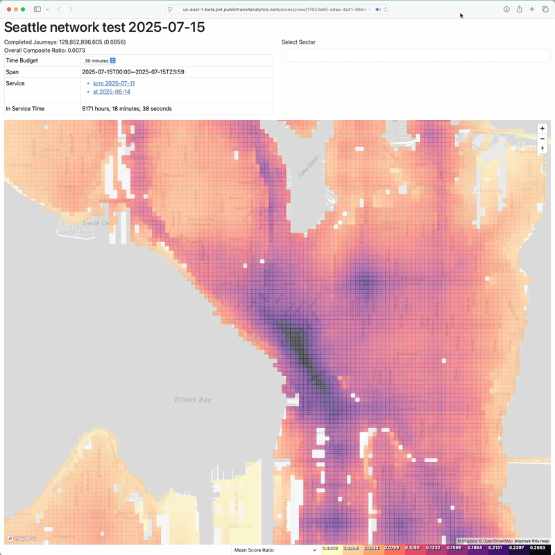
Last month, I used arf’s network modification capabilities to develop a small restructure of King County Metro’s transit network in Seattle. This change to routes 3 and 11 produced an access gain, while reducing the overall amount of service time expended. To explore ways to reinvest the service time, I expanded arf’s route modification capabilities to support frequency changes and adding new stops.
With these capabilities, I created two changes that branched off of the baseline restructure of the previous post. The first proposal ups route 11’s frequency to every 15 minutes from 6 AM to 7 PM, allowing it to meet Seattle’s definition of frequent transit service. The second maintains the existing frequency, but extends route 11 to the Eastlake neighborhood, using streets that have not had transit service for 10 years. A third change combines the two. Subsequent sections of this post will address each change.
[Read More]