Due to a computational error, the data and conclusions in this post may not be accurate.
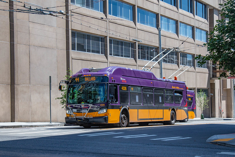
“Seattle Route 44 | NFI XT40 | NE 45th St @ 12th Ave” by Han Zheng is licensed under CC BY-SA 2.0.
When I last looked at access-based route productivity, I found that a sample of Metro’s conventional bus routes nearly-categorically outperformed a selection of trolleybus routes. The type of vehicle wasn’t the only difference between the two groups, though; they each had a geographic bias. The trolleybus routes all serve Queen Anne Hill; the conventional buses connect downtown Seattle and neighborhoods to its north by way of the Aurora Bridge.
I previously warned about the negative consequences of using mode to judge the effectiveness of transit routes. But the trolleybus routes considered to this point are less valuable than the conventional routes. The reasons for that are, plausibly, due to the infrastructure that underpins them. It would not be wise, though, to rely on an incomplete and skewed result like this to make sweeping conclusions about trolleybuses as a mode. An assortment of King County Metro’s routes run under trolley wire, and there’s nothing about that that condemns them all to ineffectiveness. To demonstrate this, I calculated the same set of access-based route productivity metrics for all of the remaining trolleybus routes.
Route Journeys are the number of completed journeys1 in which the route is part of the fastest path between the origin and destination. Higher numbers are better, but I don’t consider this to be a useful measurement on its own. It’s a building block for other measurements.
| Route | Route Journeys (45 min) | Route | Route Journeys (30 min) | Route | Route Journeys (20 min) |
|---|---|---|---|---|---|
| E Line | 28,377,307,178 |
E Line | 6,292,756,511 |
E Line | 1,201,864,328 |
| 44 | 19,689,800,910 |
7 | 4,754,536,990 |
7 | 1,193,842,481 |
| 5 | 15,739,704,337 |
5 | 4,465,621,537 |
5 | 991,394,672 |
| 7 | 14,398,892,846 |
44 | 4,214,052,659 |
36 | 911,498,106 |
| 36 | 11,530,932,638 |
36 | 3,764,192,714 |
44 | 730,981,871 |
| 49 | 6,756,752,573 |
28 | 1,576,550,802 |
28 | 345,350,872 |
| 14 | 5,740,919,275 |
49 | 1,507,214,590 |
49 | 303,723,403 |
| 28 | 5,552,200,124 |
14 | 1,384,882,908 |
14 | 285,371,667 |
| 70 | 5,107,978,566 |
70 | 1,093,194,684 |
2 | 273,933,357 |
| 3 | 3,742,123,871 |
3 | 972,740,466 |
3 | 262,988,772 |
| 2 | 3,528,086,836 |
2 | 958,885,815 |
70 | 207,699,362 |
| 1 | 3,436,900,336 |
4 | 774,856,324 |
4 | 206,374,589 |
| 4 | 2,908,369,843 |
1 | 700,897,422 |
1 | 172,353,188 |
| 43 | 2,683,333,758 |
12 | 578,835,000 |
12 | 167,408,794 |
| 10 | 2,055,624,194 |
43 | 566,180,334 |
13 | 118,378,786 |
| 12 | 1,793,705,356 |
10 | 458,005,983 |
43 | 110,494,348 |
| 13 | 1,729,648,532 |
13 | 415,950,524 |
10 | 103,687,116 |
The Journeys per In-Service Second account for these routes having varying in-service time. Higher is better.
| Route | Journeys/In-Service Second (45 min) | Route | Journeys/In-Service Second (30 min) | Route | Journeys/In-Service Second (20 min) |
|---|---|---|---|---|---|
| 44 | 47,795 |
5 | 11,747 |
5 | 2,608 |
| 5 | 41,403 |
28 | 11,306 |
28 | 2,477 |
| 43 | 40,002 |
44 | 10,229 |
44 | 1,774 |
| 28 | 39,818 |
E Line | 8,767 |
36 | 1,751 |
| E Line | 39,533 |
43 | 8,440 |
E Line | 1,674 |
| 49 | 22,968 |
36 | 7,233 |
43 | 1,647 |
| 36 | 22,156 |
7 | 6,200 |
7 | 1,557 |
| 14 | 20,719 |
49 | 5,123 |
49 | 1,032 |
| 7 | 18,775 |
14 | 4,998 |
14 | 1,030 |
| 1 | 16,862 |
1 | 3,439 |
12 | 942 |
| 70 | 11,742 |
12 | 3,257 |
1 | 846 |
| 4 | 11,448 |
4 | 3,050 |
4 | 812 |
| 10 | 10,869 |
2 | 2,643 |
2 | 755 |
| 13 | 10,677 |
13 | 2,568 |
13 | 731 |
| 12 | 10,093 |
70 | 2,513 |
3 | 679 |
| 2 | 9,726 |
3 | 2,510 |
10 | 548 |
| 3 | 9,655 |
10 | 2,422 |
70 | 477 |
Replaceable Journeys are the number of journeys featuring a fastest path that includes the route, but still could be made within the time budget with that route eliminated. It can be made with a different combination of transit routes and walking. A lower number signifies higher performance, but, like the route journeys measurement, there is no accounting for the service investment. A route may have a lower number here not because it is inherently irreplaceable, but simply has fewer journeys to lose. Thus, I consider this to be another building block.
| Route | Replaceable Journeys (45 min) | Route | Replaceable Journeys (30 min) | Route | Replaceable Journeys (20 min) |
|---|---|---|---|---|---|
| 13 | 1,430,885,654 |
43 | 320,296,206 |
43 | 51,026,680 |
| 12 | 1,469,759,893 |
13 | 320,869,223 |
13 | 66,750,279 |
| 10 | 1,689,669,258 |
10 | 346,874,124 |
10 | 67,018,591 |
| 43 | 1,798,920,722 |
12 | 414,933,053 |
12 | 86,300,470 |
| 4 | 2,336,399,347 |
1 | 507,715,008 |
70 | 91,866,079 |
| 1 | 2,550,687,802 |
70 | 561,013,470 |
1 | 100,467,307 |
| 2 | 2,825,097,323 |
4 | 568,506,173 |
4 | 117,285,518 |
| 3 | 2,936,686,177 |
2 | 684,545,135 |
49 | 120,844,310 |
| 70 | 3,565,395,158 |
3 | 696,107,637 |
28 | 128,173,958 |
| 28 | 4,250,468,148 |
49 | 820,399,793 |
14 | 135,525,025 |
| 14 | 4,326,975,252 |
14 | 842,421,729 |
3 | 146,412,160 |
| 49 | 4,823,628,747 |
28 | 873,930,129 |
2 | 151,833,945 |
| 36 | 8,737,068,647 |
44 | 1,846,813,750 |
44 | 268,660,101 |
| 7 | 10,694,700,184 |
36 | 2,072,729,096 |
36 | 331,694,995 |
| 5 | 11,543,298,480 |
5 | 2,270,017,974 |
5 | 345,910,337 |
| 44 | 12,123,605,461 |
7 | 2,648,775,563 |
E Line | 416,531,786 |
| E Line | 17,553,294,642 |
E Line | 2,726,596,110 |
7 | 461,426,803 |
One way to account for the level of investment is to look at the replaceable journeys as a proportion of the route journeys. This is the Percent Replaceable. Lower is better.
| Route | % Replaceable (45 min) | Route | % Replaceable (30 min) | Route | % Replaceable (20 min) |
|---|---|---|---|---|---|
| 44 | 61.57% |
E Line | 43.33% |
E Line | 34.66% |
| E Line | 61.86% |
44 | 43.83% |
5 | 34.89% |
| 43 | 67.04% |
5 | 50.83% |
36 | 36.39% |
| 70 | 69.80% |
70 | 51.32% |
44 | 36.75% |
| 49 | 71.39% |
49 | 54.43% |
28 | 37.11% |
| 5 | 73.34% |
36 | 55.06% |
7 | 38.65% |
| 1 | 74.21% |
28 | 55.43% |
49 | 39.79% |
| 7 | 74.27% |
7 | 55.71% |
70 | 44.23% |
| 14 | 75.37% |
43 | 56.57% |
43 | 46.18% |
| 36 | 75.77% |
14 | 60.83% |
14 | 47.49% |
| 28 | 76.55% |
2 | 71.39% |
12 | 51.55% |
| 3 | 78.48% |
3 | 71.56% |
2 | 55.43% |
| 2 | 80.07% |
12 | 71.68% |
3 | 55.67% |
| 4 | 80.33% |
1 | 72.44% |
13 | 56.39% |
| 12 | 81.94% |
4 | 73.37% |
4 | 56.83% |
| 10 | 82.20% |
10 | 75.74% |
1 | 58.29% |
| 13 | 82.73% |
13 | 77.14% |
10 | 64.64% |
Another would be to simply look at the number of journeys that could not be replaced in proportion to in-service time, the Lost Journeys per In-Service Second.
| Route | Lost Journeys/In-Service Second (45 min) | Route | Lost Journeys/In-Service Second (30 min) | Route | Lost Journeys/In-Service Second (20 min) |
|---|---|---|---|---|---|
| 44 | 18,366 |
5 | 5,775 |
5 | 1,698 |
| E Line | 15,079 |
44 | 5,746 |
28 | 1,557 |
| 43 | 13,184 |
28 | 5,039 |
44 | 1,122 |
| 5 | 11,039 |
E Line | 4,968 |
36 | 1,114 |
| 28 | 9,335 |
43 | 3,666 |
E Line | 1,094 |
| 49 | 6,571 |
36 | 3,250 |
7 | 955 |
| 36 | 5,368 |
7 | 2,746 |
43 | 887 |
| 14 | 5,103 |
49 | 2,335 |
49 | 622 |
| 7 | 4,830 |
14 | 1,958 |
14 | 541 |
| 1 | 4,348 |
70 | 1,223 |
12 | 456 |
| 70 | 3,546 |
1 | 948 |
1 | 353 |
| 4 | 2,251 |
12 | 922 |
4 | 351 |
| 3 | 2,078 |
4 | 812 |
2 | 337 |
| 2 | 1,938 |
2 | 756 |
13 | 319 |
| 10 | 1,935 |
3 | 714 |
3 | 301 |
| 13 | 1,844 |
10 | 588 |
70 | 266 |
| 12 | 1,823 |
13 | 587 |
10 | 194 |
The stratification between conventional and trolleybus modes that emerged in the last post has been weakened. Trolleybus and conventional routes have gotten mixed together. Route 44 has managed to claim a few top spots. In a small way the trolleybuses have had their revenge.
Route 7
Is it too cute to call route 7 the E Line’s cousin in South Seattle? Some of the same terminology gets used to describe it. To some, it’s seen as challenging, others call it colorful. For transit operator and writer Nathan Vass, both have been enduring muses.
One certain commonality is the popularity of the route. Like it’s Aurora Avenue-traversing relative, it’s in the top 25% of all of Metro’s ridership-based productivity categories.
| Time Budget | Route 7 Journeys | % of All Journeys | Journeys/In-Service Second |
|---|---|---|---|
| 45 min | 14,398,892,846 |
3.5508% |
18,775 |
| 30 min | 4,754,536,990 |
3.1542% |
6,200 |
| 20 min | 1,193,842,481 |
2.2283% |
1,557 |
When measuring access, the comparison breaks down. It’s unexceptional by all measurements, at all time budgets. I suspect that it comes down to overlap, because it’s not that different than the routes in the last installment. It’s just flipped around to serve neighborhoods to the south instead, and with stop spacing that is a midpoint of the E Line’s and route 5’s. Route 7 overlaps with many routes through downtown. As it gets to South Jackson Street, the number is reduced, but still substantial. Route 106 joins it here, and remains until Mount Baker Station. That’s more overlap than the previous routes entail.
| Time Budget | Replaceable Journeys | % Replaceable | Lost Journeys/In-Service Second |
|---|---|---|---|
| 45 min | 10,694,700,184 |
74.27% |
4,830 |
| 30 min | 2,648,775,563 |
55.71% |
2,746 |
| 20 min | 461,426,803 |
38.65% |
955 |
Overlap isn’t always a bad thing. Short stretches of it can set up transfers, which can improve the access-based measurements by making the route part of journeys that begin or end far from its corridor. In the case of route 7, too much overlap could be weighing its measurements down. This could be signaling that shortening either it or the overlapping routes—and reinvesting that service—could pay dividends.
Or it may have nothing to do with overlapping routes at all! The distances between parallel transit corridors influence these measurements too. The walking environment around stops also affects the journeys per in-service second quite directly. The route-level, access-based measurements don’t make it clear what exactly is the cause, but without them it’s hard to see that there’s even the potential for improvement. Ridership measurements don’t show it.
Route 10
A fairly short route, route 10 connects Volunteer Park to Downtown Seattle via Capitol Hill Station. It’s in the bottom 25% of passenger miles per platform mile in all of Metro’s time periods.
| Time Budget | Route 10 Journeys | % of All Journeys | Journeys/In-Service Second |
|---|---|---|---|
| 45 min | 2,055,624,194 |
0.5069% |
10,869 |
| 30 min | 458,005,983 |
0.3038% |
2,422 |
| 20 min | 103,687,116 |
0.1935% |
548 |
Among the three access based measurements, it’s never outside of the bottom 5. Being short limits how many journeys a route can be a part of, but the route doesn’t excel even when normalized for in-service hours. Very little of route 10’s routing is exclusive to it, and a substantial part of that portion is not far removed from service on 19th Avenue East.
| Time Budget | Replaceable Journeys | % Replaceable | Lost Journeys/In-Service Second |
|---|---|---|---|
| 45 min | 1,689,669,258 |
82.20% |
1,935 |
| 30 min | 346,874,124 |
75.74% |
588 |
| 20 min | 67,018,591 |
64.64% |
194 |
King County Metro has upcoming plans for route 10 that disconnect it from Capitol Hill Station. This reduces overlap, but I suspect depriving it of this transfer opportunity will hurt its access contribution overall.
Route 12
Route 12 is even more subject to Metro’s upcoming plans. It presently runs between Downtown Seattle and Interlaken Park, but the RapidRide G Line will replace, and slightly extend, the substantial portion that runs on Madison Street. The part serving 19th Avenue East will retain the 12 monicker, and be connected to downtown via a route that largely overlaps with route 10.
Present day route 12 is in the top 25% of rides per platform hour during peak, but in the bottom 25% of off-peak passengers per platform mile. It’s also in the bottom 25% of both measurements at night, on Saturday, and on Sunday. As an aside, it’s curious that Metro’s plans for the G Line involve incredible 6 minute peak and midday frequencies on weekdays and Saturdays, but a massive drop to 15 minutes on Sunday. Metro’s stance is that managing crowding is the primary driver of service allocation. The ridership data suggests a surfeit of capacity already on Saturdays, if anything. Far be at from me to suggest that frequency should always mirror demand, but Metro isn’t being internally consistent here.
| Time Budget | Route 12 Journeys | % of All Journeys | Journeys/In-Service Second |
|---|---|---|---|
| 45 min | 1,793,705,356 |
0.4423% |
10,093 |
| 30 min | 578,835,000 |
0.3840% |
3,257 |
| 20 min | 167,408,794 |
0.3125% |
942 |
Route 12 is not a strong performer by the access based measurements, though it reaches the middle of the pack for 20-minute journeys across them. Its corridor is only intermittently shared, but it is in close proximity to several others. This will remain largely true even after Metro’s post-G Line changes are put in place. It will be interesting to see if the enhancements that the bus rapid transit designation brings are at all consequential, access-wise. As for the new route 12, I expect it to struggle to match even the middling performance seen today.
| Time Budget | Replaceable Journeys | % Replaceable | Lost Journeys/In-Service Second |
|---|---|---|---|
| 45 min | 1,469,759,893 |
81.94% |
1,823 |
| 30 min | 414,933,053 |
71.68% |
922 |
| 20 min | 86,300,470 |
51.55% |
456 |
Route 14
Route 14 is through-routed with route 1, so what is considered to be route 14 varies depending on the direction of travel. Northbound route 14 trips switch over to route 1 as they pass through Chinatown, but southbound route 14 trips start in Belltown. This means that in the northbound direction, very little of the alignment is shared. A large portion of it is when going southbound, on account of traveling through downtown and Chinatown. Aside from that, this is a pretty typical old school, downtown-to-residential-neighborhood trolleybus route, with Mount Baker being the aforementioned neighborhood.
Route 14 is all across the board in Metro’s productivity measurements. It’s in the top 25% of rider per platform hour for peak times and on Sundays. Off-peak, at night, on Saturday, and on Sunday it’s in the bottom 25% of passenger miles per platform mile.
| Time Budget | Route 14 Journeys | % of All Journeys | Journeys/In-Service Second |
|---|---|---|---|
| 45 min | 5,740,919,275 |
1.4157% |
20,719 |
| 30 min | 1,384,882,908 |
0.9188% |
4,998 |
| 20 min | 285,371,667 |
0.5326% |
1,030 |
When considering access, route 14 is consistently middling in this sample of routes, regardless of measurement or time budget.
| Time Budget | Replaceable Journeys | % Replaceable | Lost Journeys/In-Service Second |
|---|---|---|---|
| 45 min | 4,326,975,252 |
75.37% |
5,103 |
| 30 min | 842,421,729 |
60.83% |
1,958 |
| 20 min | 135,525,025 |
47.49% |
541 |
Route 36
Running atop Beacon Hill, route 36 shares some similarities with route 7 to its east. Its path is largely along a single street, and there are significant periods of overlap with other routes. Both also connect non-contiguous Link stations. By Metro’s ridership measurements, it is a top 25% performer in rides per platform hour at all times.
| Time Budget | Route 36 Journeys | % of All Journeys | Journeys/In-Service Second |
|---|---|---|---|
| 45 min | 11,530,932,638 |
2.8436% |
22,156 |
| 30 min | 3,764,192,714 |
2.4972% |
7,233 |
| 20 min | 911,498,106 |
1.7013% |
1,751 |
Route 36 shows an interesting trend across the three access-based measurements. As the time budget decreases, its ranking across measurements improves, typically from middling to near the top. I suspect that its multiple interactions with the Link could play a role. Riding a long distance on route 36 is unlikely to be the fastest way to reach a destination. When going between remote locations where the Link and route 36 are both options, the Link will typically be the better choice. Route 36 still serves to connect less-distant destinations between Link stations. When fewer journeys are possible due to a shorter time budget, the journeys between Link stations will be a greater proportion of the total.
| Time Budget | Replaceable Journeys | % Replaceable | Lost Journeys/In-Service Second |
|---|---|---|---|
| 45 min | 8,737,068,647 |
75.77% |
5,368 |
| 30 min | 2,072,729,096 |
55.06% |
3,250 |
| 20 min | 331,694,995 |
36.39% |
1,114 |
Route 43
Route 43 is a shell of its former self. Most of its trips seem like a way to count buses deadheading to the start of route 44 as in service. There are a few trips not matching that description—these are trips to and from downtown—during the peak periods. At one time, though, this was a major part of the connectivity between Capitol Hill and the University District. The expansion of the Link has diminished its role. Originally, Metro planned to cancel the route once the Link reached the University of Washington. A combination of the Link and routes 8 and 48 would cover its path. Instead, it holds on by a thread.
Metro’s ridership measurements show a diminished route. It’s in the bottom 25% of every measurement except peak rides per platform hour. It’s hard to expect otherwise, due to its intermittent scheduling, based more around operational considerations for route 44 than passenger desire.
| Time Budget | Route 43 Journeys | % of All Journeys | Journeys/In-Service Second |
|---|---|---|---|
| 45 min | 2,683,333,758 |
0.6617% |
40,002 |
| 30 min | 566,180,334 |
0.3756% |
8,440 |
| 20 min | 110,494,348 |
0.2062% |
1,647 |
This route doesn’t seem like it would excel in the access-based measurements either. It’s overlapped by other routes for almost its entire course. I was genuinely shocked when I saw how it ranked. For 45-minute trips, this is the third-best route for the three measurements. It’s at worst middling at the other times.
I have a couple of theories that may, in combination, explain this. First is that its most common variant doesn’t go downtown, where service hours are burned by overlapping with a bunch of routes. Second, the route runs a disproportionate amount of its service in the early morning and at night—when route 44 service is starting up or winding down. At these times, the Link, and the other routes on the route 43 corridor, have not started their full-frequency operations. There are more journeys available for it to pick up than there would be once those routes are running at peak frequency. In this way, its small number of in-service hours are used effectively, in spite of overlap.
I doubt route 43 would match these numbers if it had frequent, full-day service, or the routes it overlapped with ran at high frequencies throughout the day. Its unexpected presence among the best routes is a reminder that access measurements involve not just the spatial properties of a routing, but the temporal elements of a schedule.
| Time Budget | Replaceable Journeys | % Replaceable | Lost Journeys/In-Service Second |
|---|---|---|---|
| 45 min | 1,798,920,722 |
67.04% |
13,184 |
| 30 min | 320,296,206 |
56.57% |
3,666 |
| 20 min | 51,026,680 |
46.18% |
887 |
Route 44
Route 44 is distinct among trolleybus routes: It’s the only one that does not serve Downtown Seattle. It’s also unique in this way among the routes that have been analyzed in this series. It runs from Ballard to the University of Washington Medical Center via Wallingford. Some trips are interlined with route 43, but most are not.
Being unusual doesn’t hinder its popularity among riders. It ranks in the top 25% of all of Metro’s productivity measurements, except passenger miles per platform mile on weekday nights.
| Time Budget | Route 44 Journeys | % of All Journeys | Journeys/In-Service Second |
|---|---|---|---|
| 45 min | 19,689,800,910 |
4.8556% |
47,795 |
| 30 min | 4,214,052,659 |
2.7957% |
10,229 |
| 20 min | 730,981,871 |
1.3644% |
1,774 |
The access-based productivity measurements see merit in it too. For the 45-minute time budget, it’s the best route in each. It never drops below fourth for any duration, measurement pair. Route 44 may not resemble its trolleybus brethren, but it’s clearly better off for it.
| Time Budget | Replaceable Journeys | % Replaceable | Lost Journeys/In-Service Second |
|---|---|---|---|
| 45 min | 12,123,605,461 |
61.57% |
18,366 |
| 30 min | 1,846,813,750 |
43.83% |
5,746 |
| 20 min | 268,660,101 |
36.75% |
1,122 |
Route 49
Like route 43, route 49 was more popular in the recent past. Connecting the University District to Downtown via Capitol Hill, it now shares that responsibility with the Link. Unlike route 43, its path between Capitol Hill and the University District is quite direct, with a stretch in northern Capitol Hill that it shares with no other route. There were never plans to scrap it, because there are no alternatives for the infill that it provides between stations.
While I doubt that the ridership compares to the pre-Link days, the productivity measurements still indicate solid performance. At night, it’s in the top 25% of riders per platform hour. It’s never in the bottom 25%.
| Time Budget | Route 49 Journeys | % of All Journeys | Journeys/In-Service Second |
|---|---|---|---|
| 45 min | 6,756,752,573 |
1.6662% |
22,968 |
| 30 min | 1,507,214,590 |
0.9999% |
5,123 |
| 20 min | 303,723,403 |
0.5669% |
1,032 |
From an access standpoint, route 49 is a universally unremarkable route within the sample collected thus far. I would suspect it’s weighed down somewhat by the heavy concentration of overlapping routes between downtown and Capitol Hill—a situation that seems stuck in a pre-Link reality.
| Time Budget | Replaceable Journeys | % Replaceable | Lost Journeys/In-Service Second |
|---|---|---|---|
| 45 min | 4,823,628,747 |
71.39% |
6,571 |
| 30 min | 820,399,793 |
54.43% |
2,335 |
| 20 min | 120,844,310 |
39.79% |
622 |
Route 70
The final trolleybus route, route 70 serves the Eastlake and South Lake Union neighborhoods in the course of connecting Downtown Seattle and U District Station. It’s in the top 25% of Metro’s productivity measurements at peak times, and never in the bottom 25% otherwise.
| Time Budget | Route 70 Journeys | % of All Journeys | Journeys/In-Service Second |
|---|---|---|---|
| 45 min | 5,107,978,566 |
1.2597% |
11,742 |
| 30 min | 1,093,194,684 |
0.7252% |
2,513 |
| 20 min | 207,699,362 |
0.3877% |
477 |
The ranks of its access-based measurements look like they were randomly generated. They run the gamut from worst in the sample, when considering 20-minute journeys per in-service second, to fourth-best in 30- and 45-minute percent replaceable.
I suspect geography is playing a role here. Eastlake is bounded by Lake Union to the west, and a steep hill up to Interstate 5 to the east. For route 70’s stops in Eastlake, there is less land area within walking distance than for stops in most other places. Fewer journeys will involve the route when it is more difficult to reach stops along its alignment, especially for short time budgets. Naturally, this will hurt the journeys per in-service second and the lost journeys per in-service second. For the percent replaceable, the cost of poor walkability is factored out, since it is present in both components of the ratio.
Before examining route 70, I wasn’t exactly sure what would cause divergence in the access-based measurements. Many, but not all, of the routes analyzed so far have ranked similarly across them. Route 70 demonstrates a way in which percent replaceable helps clarify the cause of a low journeys per in-service second. The latter may suffer when multiple nearby or overlapping routes are competing for journeys. It is also the case, though, that a corridor itself can have characteristics that diminish the value of stops along it. If a transit agency were to solely use poor performance in that measurement as a trigger to take action on routes, it could draw mistaken conclusions. Removing a route solely because it’s part of proportionally few journeys could still be a bad idea. That route may be the only way that those living along its corridor can access transit.
| Time Budget | Replaceable Journeys | % Replaceable | Lost Journeys/In-Service Second |
|---|---|---|---|
| 45 min | 3,565,395,158 |
69.80% |
3,546 |
| 30 min | 561,013,470 |
51.32% |
1,223 |
| 20 min | 91,866,079 |
44.23% |
266 |
Thinking About the Results
Are all trolleybus routes doomed to provide substandard access? The answer to that is an emphatic “no.” Within a growing sample of routes, route 44 has grabbed the top spots for 45-minute durations, and does fine for the other budgets. Routes 7, 36, 43, 49, and 70 jump above the lowest-ranked conventional route in certain contexts. Nevertheless, this batch of trolleybus routes lowered the floor of several measurements. In general, they still perform worse than the conventional routes considered thus far.
There aren’t hard and fast rules around what a trolleybus route can look like, but there are conventions. King County Metro’s network of these routes is characterized by having trunks and branches. The central trunk is downtown. Some routes branch directly off of it, but others proceed along shared paths toward Queen Anne, Capitol Hill, or through Chinatown. From those, single routes split off into exclusive branches. While it makes efficient use of trolley wire, it’s bad for maximizing a route’s access (and for maximizing access on the whole) because of competition along the trunks. On top of that, expanding a route involves a significant infrastructural investment, keeping them short. That’s not a problem on its own, but it means that the service time invested in traversing the trunk—where the route will be a part of fewer journeys—may dwarf the time spend on the more valuable branch. The easiest way to implement a trolleybus route sets it up to fail.
Metro is capable of breaking those conventions though. Routes 5, 28, and the E Line resemble the average trolleybus route more than route 44 does. The latter’s superlative contributions to access within Metro’s network show that there is value in being distinct. When it comes to scoring badly in route-level access, the issue isn’t really about mode, it’s about a generally uninspired approach to network construction.
-
Consult the first post in the series for an explanation of journeys. ↩︎