Due to a computational error, the data and conclusions in this post may not be accurate.
I received a package from Amazon the other day, and I noticed something hidden under the shipping label. My first full-time job was writing software for its warehouse operations, and I had a passionate love-hate relationship with it. I had to take a closer look.
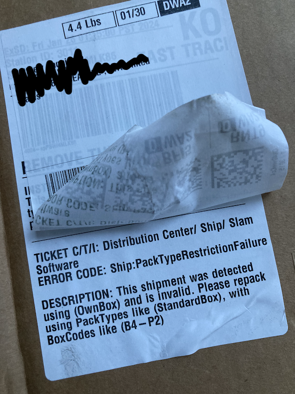
PackTypes! I remember those! Without delving too much into the minutiae of Amazon’s warehouse operations, they’re broad categories of packaging. Back then, I saw their use in enforcing appropriate packaging as clunky and inflexible. In my view, the solution was to relegate the PackType concept to the dustbin of history, in favor of granular packaging instructions that would impose restrictions on a shipment by shipment basis. I wrote design documents for this. I navigated the web of systems that referenced PackType and proposed migration plans for each one. I advocated for it as an organizational priority whenever I had the ear of management.
“Thinking small is a self-fulfilling prophecy,” proclaims Amazon’s “Think Big” leadership principle. Removing PackType felt big in its scope, but it never inspired action. Nearly 10 years after I left Amazon’s warehouse software group, I see evidence of PackType still being there! Thinking big can mean a lot of different things, I guess. To me it was that it was rational to propose ripping out something that had wormed its way into many corners of the organization’s systems, causing pain for developers, warehouse workers, and customers in subtle ways. I think the most common interpretation inside Amazon, though, concerns the magnitude of the end results, rather than the scope of work. Would thinking big yield a flashier feature or gaudier cost savings when the work is over? In that mindset, eliminating PackType wasn’t thinking big, it was just doing a lot of dreary housecleaning.
With my sensibilities, the encouragement to think big can poison the mind. It makes sweeping changes seem like the only possible way to do things that are virtuous and necessary. Thinking big has been an invitation to be perceived as naive and unrealistic. Proposing to rebuild King County Metro’s transit network in Seattle around optimizing for all-day, citywide access is very big, but it has largely been ignored, and has drawn ire at worst. I’ll have to think smaller too. Small self-fulfilling prophecies aren’t all bad; at least something comes true.
Every year King County Metro publishes a System Evaluation, which I usually pay little mind. That may seem weird because it’s an analytical document about evaluating a transit network, and I write analytical documents about evaluating transit networks. I know that it will assess the network in ways so different than my own that they will seem irreconcilable, so why bother.
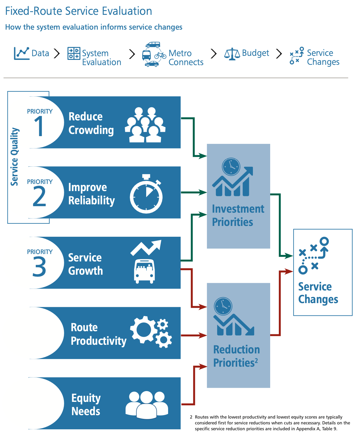
From King County Metro’s 2023 Service Evaluation
Consider this diagram summarizing the process flow for fixed-route service evaluation. I could raise strenuous objections to the priorities and measurements employed throughout it, but I’ve done enough of that already. Thinking big would mean blowing this process up; thinking small means hooking into an existing part of it. That part is route productivity.
What is Route Productivity?
Route productivity is a class of measurements that King County Metro uses to assess transit routes. Unproductive routes are candidates for elimination or frequency reductions. This could be due to budgetary reasons, or reallocating resources to fulfill other priorities. When trips or even whole routes are canceled, Metro wants the change to impact as few people—in particular, people who depend on public transit—as possible.
Details on what route productivity actually is, and justification of the measurements that it entails, are surprisingly scarce in the main document. Even the appendices treat it somewhat obliquely. The table footnoted in the diagram refers to “both productivity measures” without any indication of what they are. That requires consulting the tables in Appendix H, where they are revealed to be “Riders per Platform Hour” and “Passenger Miles per Platform Mile,” and left unexplained. “Riders per Platform Hour” is a count of passengers using a route divided by the time that the transit vehicles of the route are in operation. “Passenger Miles per Platform Mile” is the quotient of the combined distance covered by all passengers of the route and the cumulative distance covered by all vehicles serving it. These measurements are just reworked versions of the Unlinked Passenger Trips and Passenger Miles Traveled measurements that Metro reports to the Federal Transit Administration anyway, so perhaps that alone is to serve as justification for their use. At a high level, they identify routes where there is misalignment between the investment and their use by riders. Each measurement is further split for the weekday peak, weekday off-peak, weekday night, Saturday, and Sunday time periods. Metro assigns a level of unproductiveness to routes based, in part, on how many periods score in the bottom 25% and 50% of one or both measurements.
I don’t think there’s anything terribly objectionable about understanding how many people are riding and how long they’re staying aboard. I fall out of line with basically all transit planning policy when I assert that making any route-planning decision based on any route-level aggregation is a bad idea. People don’t ride transit because they have loyalty to routes. They want to reach their desired destinations, and there are countless combinations of hypothetical routes that could make that possible. A route that is unproductive by Metro’s measurements may not be that way because of an intrinsic lack of demand. A way to make it productive might be to change other routes—allowing for new connections or eliminating duplication that splits demand. When considering the elimination of a route, the impact on the entire transit network should be measured, and then, perhaps, the whole network should be changed.
Unfortunately, this is hard. I believe that transit agencies could take steps to make it less hard, but the amount of work will always be greater than canceling some trips or striking a route from maps. As much as I’d like to implore transit agencies to never make decisions at the route level, that is thinking too big. Outside of their longest-term plans, agencies make decisions about individual routes. There are limits to what the current ridership-based route productivity measurements can capture, though. They can be supplemented by other measurements that still conform with a route-based framework.
Inventing Some Productivity Measurements
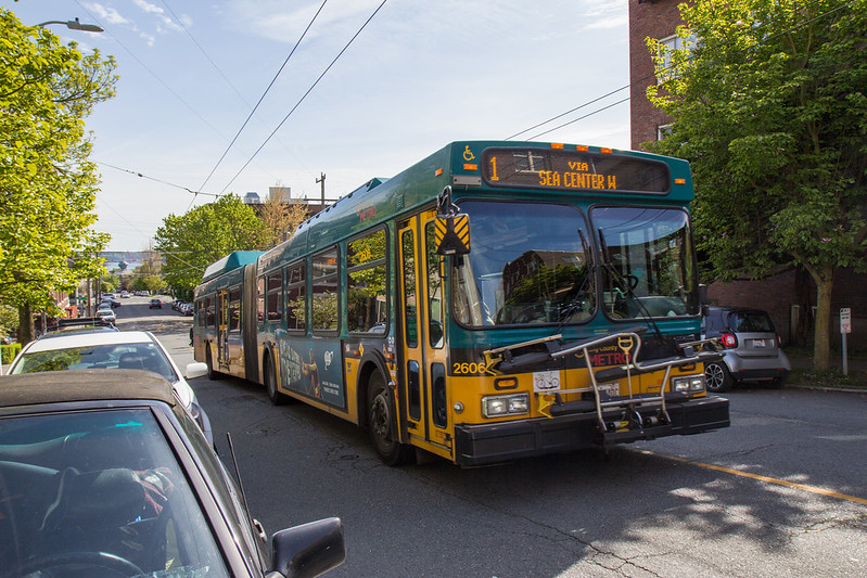
“Route 1 Artic” by Atomic Taco is licensed under CC BY-SA 2.0.
Access-based route productivity measurements would bring some of the benefits of network-level thinking to measurements that are reported at the route level. I’ve been working on some measurements, and will demonstrate them with King County Metro’s route 1.
Route 1—not to be confused with Sound Transit’s Link 1-Line—is a pretty unremarkable King County Metro bus route, and it has been chosen only because it’s the first one. Metro’s maps for route 1 indicate its endpoints as Downtown Seattle and Kinnear, which is strange because the route runs past Kinnear Park, but the West Queen Anne neighborhood that it ends in doesn’t seem to be known by that name. The downtown endpoint has a different quirk, owing to routes 1 and 14 being through-routed. Most southbound route 1 buses cease to be signed with that route in Belltown and continue through Downtown as route 14. Most northbound route 1 buses take on route 1 signage prior to Downtown, as they go through Chinatown. Aside from these idiosyncrasies, it’s pretty conventional; it connects a residential area to the downtown business district. By the existing route productivity standards, it falls in the bottom 25% category for passenger miles per platform mile on weekdays off-peak, but in the top 25% of riders per platform hour for nights, Saturdays, and Sundays. Metro would judge it as neither particularly productive nor unproductive.
I calculate an access measurement that captures the value of the transit network to an individual who wants to move throughout an area, using transit and walking, at all times of day, and will not tolerate arbitrarily long travel times. This is done by dividing an area, in this case the city of Seattle, into a grid of 80 meter squared sectors. For the combination of these sectors, and for each minute of the day, I compute the fastest path to each of the other sectors, using transit and walking, with a bounded time budget. Each combination of origin, destination, and starting time that corresponds to a trip that can be made within the budget is called a completed journey. A transit network’s success is based on the value of the ratio between completed journeys and all possible journeys. Because individuals’ time budgets vary, I computed three access analyses, with a 20 minute, 30 minute, and 45 minute limit.
Captured alongside the count of completed journeys are the routes that were used in each one. This allows determining how frequently a route appears in the paths that make up the completed journeys, which serves as the first component of access-based productivity measurement. Using this alone would likely deem the most productive routes to be those with the most service, though. The access analysis also determines the number of in-service hours1 for each route. Dividing the appearances by the in-service hours produces a measurement that is comparable to the existing route productivity ones. Both are assessing a form of efficiency, but they value different resources. The existing measurements focus on what is happening: how many riders are actually using the route to get places. This new one is concerned with the route’s capability to move people throughout the city.
| Time Budget | Route 1 Journeys | % of All Journeys | Journeys/In-Service Second |
|---|---|---|---|
| 45 min | 3,436,900,336 |
0.8476% |
16,862 |
| 30 min | 700,897,422 |
0.4650% |
3,439 |
| 20 min | 172,353,188 |
0.3217% |
846 |
Why consider capability when information about what people are actually doing is already being used? Passenger counts are typically determined by sampling some portion of trips, and this can be skewed by outlier events and bad data. I also think that looking at ridership tends to penalize newly-created or changed routes. My supposition is that people don’t immediately adapt to changes in the network; most don’t instantly understand what a changed route allows them to more easily reach. Decisions based on ridership alone are at risk of being made too hastily. I see a place for both types of measurements, and I think their comparison could be instructive.
By adding another piece of information, there’s a better way to use the access data. I can calculate a second access analysis with all of route 1’s trips removed. This is not a serious proposal to eliminate route 1; the goal is to understand how irreplaceable route 1 is. The access analysis without it will have fewer completed journeys, but they aren’t reduced by the number of journeys that featured route 1 in the first analysis. Some journeys remain possible within the time budget, using a different combination of walking and transit trips. Comparing this remainder to the number of journeys featuring the route in the first analysis serves as a replaceability score for the route. It’s also possible to relay this as the number of irreplaceable journeys per in-service second of the route’s operation.
| Time Budget | Replaceable Journeys | % Replaceable | Lost Journeys/In-Service Second |
|---|---|---|---|
| 45 min | 2,550,687,802 |
74.21% |
4,348 |
| 30 min | 507,715,008 |
72.44% |
948 |
| 20 min | 100,467,307 |
58.29% |
353 |
These are expressing something that the ridership measurements can’t, but Metro ought to consider, for determining its reduction priorities. Suppose that Metro needs to reduce its budget, and is considering two routes for deletion, with approximately equal platform hours and equity factors. One scores in the bottom 25% of many of Metro’s existing route productivity measurements, the other is middling. With the ridership-based measurements, the decision is simple; cancel the underperforming route. If the idea is truly to reduce impact, though, there needs to be a way to understand how well riders of the deleted route will be served by the remaining network. If the route with middling ridership is much higher in its replaceability measurements than the one with low ridership, I would suggest it might actually be a better candidate for deletion.
I see it as possible to use these measurements in concert. Metro already employs a point system to combine route productivity and equity needs. Expanding the system to sum points for both ridership- and access-based measurements of productivity, alongside equity, seems like a sensible evolution.
Next Steps
For both the existing ridership-based route productivity measurements, and these access-based ones, a measurement from a single route is meaningless on its own. Is 18.1 riders per platform hour good or bad? Does a percent replaceable of 72.44% signify a route that must be preserved at all costs? All of these measurements are only useful when viewed in the context of all other routes. I will be scoring and ranking every route serving Seattle, releasing them in groups in upcoming posts.
I’m certainly not finished with the idea of radically restructuring King County Metro’s Seattle-based transit routes. I think there is too much to be gained from a uniform-frequency approach that considerably improves access. Whether an institution runs a transit network or ships packages, there will always be resistance to taking the time to absolutely gut the processes and systems that power its work in the present day. Revolutions do happen, but the idea of frequent 24/7 service was not the catalyst that I expected it to be. For that reason, I’m opening up a second front for providing information that improves the decisions made in transit planning, even if it’s frustratingly incremental. No matter how I feel about route-level decision making overall, there’s no reason not to propose a way to integrate missing, and necessary, information into it. An access-based measurement of replaceability adds something ridership measurements cannot, and they should coexist as equals within King County Metro’s route productivity workflow.
-
In-service hours are slightly different than the platform hours used by King County Metro. The latter includes deadheads and layovers, the former does not. ↩︎