Due to a computational error, the data and conclusions in this post may not be accurate.
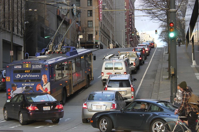
“Route 2 bus and Spring St traffic” by Oran Viriyincy is licensed under CC BY-SA 2.0.
I’m continuing to explore access-based route productivity measurements by examining four routes that, like route 1, serve Seattle’s Queen Anne neighborhood. Routes 2, 3, 4, and 13 make their way up its eponymous hill. These are some of the quirkiest routes in King County Metro’s system. The former three are putatively long routes connecting downtown Seattle with mostly-residential neighborhoods on either end, but run a variety of shortened trips. Meanwhile, route 13 is linked with some, but not all, abbreviated route 2 trips. It might be more pragmatic to think of these as six shorter routes with a common trunk downtown, but that’s not how Metro treats them. It evaluates the productivity of each route in its totality, so I will do the same. How do these routes compare when it comes to access-based route productivity measurements?
Route Journeys are the number of completed journeys1 in which the route is part of the fastest path between the origin and destination. A higher number signifies a more performant route.
| Route | Route Journeys (45 min) | Route | Route Journeys (30 min) | Route | Route Journeys (20 min) |
|---|---|---|---|---|---|
| 3 | 3,742,123,871 |
3 | 972,740,466 |
2 | 273,933,357 |
| 2 | 3,528,086,836 |
2 | 958,885,815 |
3 | 262,988,772 |
| 1 | 3,436,900,336 |
4 | 774,856,324 |
4 | 206,374,589 |
| 4 | 2,908,369,843 |
1 | 700,897,422 |
1 | 172,353,188 |
| 13 | 1,729,648,532 |
13 | 415,950,524 |
13 | 118,378,786 |
The Journeys per In-Service Second account for these routes having varying in-service time. Higher is better.
| Route | Journeys/In-Service Second (45 min) | Route | Journeys/In-Service Second (30 min) | Route | Journeys/In-Service Second (20 min) |
|---|---|---|---|---|---|
| 1 | 16,862 |
1 | 3,439 |
1 | 846 |
| 4 | 11,448 |
4 | 3,050 |
4 | 812 |
| 13 | 10,677 |
2 | 2,643 |
2 | 755 |
| 2 | 9,726 |
13 | 2,568 |
13 | 731 |
| 3 | 9,655 |
3 | 2,510 |
3 | 679 |
Replaceable Journeys are the number of journeys featuring a fastest path that includes the route, but still could be made within the time budget with that route eliminated. It can be made with a different combination of transit routes and walking. A lower number signifies higher performance, but, like the route journeys measurement, there is no accounting for the service investment. A route may have a lower number here not because it is inherently irreplaceable, but simply has fewer journeys to lose.
| Route | Replaceable Journeys (45 min) | Route | Replaceable Journeys (30 min) | Route | Replaceable Journeys (20 min) |
|---|---|---|---|---|---|
| 13 | 1,430,885,654 |
13 | 320,869,223 |
13 | 66,750,279 |
| 4 | 2,336,399,347 |
1 | 507,715,008 |
1 | 100,467,307 |
| 1 | 2,550,687,802 |
4 | 568,506,173 |
4 | 117,285,518 |
| 2 | 2,825,097,323 |
2 | 684,545,135 |
3 | 146,412,160 |
| 3 | 2,936,686,177 |
3 | 696,107,637 |
2 | 151,833,945 |
One way to account for the level of investment is to look at the replaceable journeys as a proportion of the route journeys. This is the Percent Replaceable.
| Route | % Replaceable (45 min) | Route | % Replaceable (30 min) | Route | % Replaceable (20 min) |
|---|---|---|---|---|---|
| 1 | 74.21% |
2 | 71.39% |
2 | 55.43% |
| 3 | 78.48% |
3 | 71.56% |
3 | 55.67% |
| 2 | 80.07% |
1 | 72.44% |
13 | 56.39% |
| 4 | 80.33% |
4 | 73.37% |
4 | 56.83% |
| 13 | 82.73% |
13 | 77.14% |
1 | 58.29% |
Another would be to simply look at the number of journeys that could not be replaced in proportion to in-service time, the Lost Journeys per In-Service Second.
| Route | Lost Journeys/In-Service Second (45 min) | Route | Lost Journeys/In-Service Second (30 min) | Route | Lost Journeys/In-Service Second (20 min) |
|---|---|---|---|---|---|
| 1 | 4,348 |
1 | 948 |
1 | 353 |
| 4 | 2,251 |
4 | 812 |
4 | 351 |
| 3 | 2,078 |
2 | 756 |
2 | 337 |
| 2 | 1,938 |
3 | 714 |
13 | 319 |
| 13 | 1,844 |
13 | 587 |
3 | 301 |
With figures available for only five routes, there still isn’t much context for evaluating them, but it’s a start. These measurements, in addition to Metro’s own for route productivity, will inform brief discussions of routes 2, 3, 4, and 13.
Route 2
A transit rider at route 2’s Madrona Park terminal needs to be aware that their ride may end in one of three places. Some trips terminate downtown. Others will continue to 7th Avenue West and West Raye Street on Queen Anne Hill. Some will switch to route 13 as they approach downtown and wend a different path up the hill. In this case, the section of the trip that is considered to be route 2 is just the section between Madrona Park and First Hill. Metro lumps all these variants together when assessing the productivity of the route.
My own assessment of route 2 is that its sections seem to vary widely in their utility. The section between Madrona Park and 14th Avenue serves an area that doesn’t have many alternatives. Further west, it feels nearly redundant with routes running on Pine Street and through downtown. On Queen Anne Hill, it’s never more than a few blocks from route 1 or 13, though the terrain of the area could make it difficult to cite those routes as alternatives. The route is multifaceted, but any route productivity measurement is going to assign a single value to it.
| Time Budget | Route 2 Journeys | % of All Journeys | Journeys/In-Service Second |
|---|---|---|---|
| 45 min | 3,528,086,836 |
0.8700% |
9,726 |
| 30 min | 958,885,815 |
0.6361% |
2,643 |
| 20 min | 273,933,357 |
0.5113% |
755 |
Route 2 scores in the top 25% of riders per platform hour in all periods, except weekend nights. It is never in a bottom 25% of the traditional measurements. For the access-based ones, it is near the top in route journeys, but a middling performer when it’s in-service time is accounted for. It is the best (lowest) of the five for percentage replaceable at the 30- and 20-minute budgets, but not in any of the other replaceability categories. With only a small number of routes under consideration, I’m not sure what to make of that discrepancy at this time.
| Time Budget | Replaceable Journeys | % Replaceable | Lost Journeys/In-Service Second |
|---|---|---|---|
| 45 min | 2,825,097,323 |
80.07% |
1,938 |
| 30 min | 684,545,135 |
71.39% |
756 |
| 20 min | 151,833,945 |
55.43% |
337 |
Route 3
When I classified King County Metro routes by their frequencies throughout the day, I called out route 3 as problematizing the idea that a route has a headway. While the full route is between Seattle Pacific University and Madrona, it’s possible to divide it into three sections with different frequencies. Like with route 2, I’d argue that the sections are of varying importance, based on whether there are proximate or overlapping routes. Also as before, this means a bunch of variants roll up under a single productivity measurement.
In an upcoming service revision, the Seattle Pacific University terminal will be replaced with one in Capitol Hill’s Summit neighborhood. The fact will remain that a transit trip labeled with route 3 can mean a variety of different things.
| Time Budget | Route 3 Journeys | % of All Journeys | Journeys/In-Service Second |
|---|---|---|---|
| 45 min | 3,742,123,871 |
0.9228% |
9,655 |
| 30 min | 972,740,466 |
0.6453% |
2,510 |
| 20 min | 262,988,772 |
0.4909% |
679 |
Route 3 is in the top 25% of riders per platform hour during peak periods. It’s in the bottom 25% of passenger miles per platform mile on weekday nights. In the access measurements, it comprises the largest portion of journeys of these five routes at the 45 and 30 minute levels, but when factoring in the level of service investment, it falls to the bottom. It’s consistently a high performer in terms of percent replaceable, though.
| Time Budget | Replaceable Journeys | % Replaceable | Lost Journeys/In-Service Second |
|---|---|---|---|
| 45 min | 2,936,686,177 |
78.48% |
2,078 |
| 30 min | 696,107,637 |
71.56% |
714 |
| 20 min | 146,412,160 |
55.67% |
301 |
Route 4
I find route 4 baffling. It’s identical to route 3, but rather than ending in Madrona, it terminates a little south of the Judkins Park neighborhood. Once breaking from their common path, it largely duplicates portions of routes 8 and 48. If it didn’t exist, a combination of those routes—all of which are generally more frequent than it is—should allow riders to reach points along the present route. In theory, this is something that will be reflected in the access-based productivity measurements, particularly those around replaceability.
| Time Budget | Route 4 Journeys | % of All Journeys | Journeys/In-Service Second |
|---|---|---|---|
| 45 min | 2,908,369,843 |
0.7172% |
11,448 |
| 30 min | 774,856,324 |
0.5141% |
3,050 |
| 20 min | 206,374,589 |
0.3852% |
812 |
It looks like plenty of riders don’t share my bafflement with route 4. It’s in the top 25% of riders per platform hour during the peak period, though it’s in the bottom 25% of passenger miles per platform mile on nights, Saturdays, and Sundays. Among the five routes, it scores well when qualified by its amount of in-service time. While it’s near the bottom in terms of percentage replaceable, only five routes have been considered at this point. Regardless of my preexisting feelings on the route, I can’t consider this conclusive evidence of its redundancy—at least not yet.
| Time Budget | Replaceable Journeys | % Replaceable | Lost Journeys/In-Service Second |
|---|---|---|---|
| 45 min | 2,336,399,347 |
80.33% |
2,251 |
| 30 min | 568,506,173 |
73.37% |
812 |
| 20 min | 117,285,518 |
56.83% |
351 |
Route 13
Aside from a short section between Galer Street and Boston Street, route 13 overlaps the routes appearing in this post. It follows the path of route 2 up to Queen Anne, before jumping over to that of routes 3 and 4 to reach Seattle Pacific University. Like route 4, this seems like a property that could increase its access-based measurement of replaceability.
| Time Budget | Route 13 Journeys | % of All Journeys | Journeys/In-Service Second |
|---|---|---|---|
| 45 min | 1,729,648,532 |
0.4265% |
10,677 |
| 30 min | 415,950,524 |
0.2759% |
2,568 |
| 20 min | 118,378,786 |
0.2210% |
731 |
Route 13 is in the top 25% of riders per platform hour on Saturdays and the bottom 25% in passengers per platform mile on Sundays. From an access perspective it’s the only route among these where both measurements of replaceability—percentage of trips replaceable and lost journeys per in-service second—show a concordance. It’s the worst in both of these at the 45- and 30-minute budgets.
| Time Budget | Replaceable Journeys | % Replaceable | Lost Journeys/In-Service Second |
|---|---|---|---|
| 45 min | 1,430,885,654 |
82.73% |
1,844 |
| 30 min | 320,869,223 |
77.14% |
587 |
| 20 min | 66,750,279 |
56.39% |
319 |
Some Limited Conclusions
After examining five routes, it’s still nearly impossible to understand which ones are exceptionally productive or unproductive from an access perspective. Their measurements could form one tightly clustered group amidst all of Metro’s routes. Yet it’s also plausible that, for a given measurement, two of these routes might be at opposite ends of a spectrum when considering values from the entire network.
If I had to guess, I would suspect the former. These routes share some significant similarities. Most have substantial overlap with the others, but also sections that are unique. These sections, if treated as different routes, might have wider-ranging measurements. When they are grafted together, the result will be a more-average measurement, yielding a tighter clustering. On top of that, trips on routes 2 and 3 don’t even correspond to a consistent series of stops. This will, in a different way, cause unlike things to get averaged together. Most of King County Metro’s routes aren’t like this.
I also want to call attention to the discordance between and within measurements. With some exceptions, routes generally don’t seem to fall into consistent slots across measurements, or even across time budgets within the same one. The former isn’t surprising for those that are a journey count versus those that normalize that count with the route’s in-service time; they are measuring fundamentally different things. My intuition, though, was that the lost routes per in-service hour and percentage replaceable would measure a some singular aspect of the route. Instead, they are rarely in concordance. Again, though, when the full range of these values is unknown, a ranking of five samples is not a basis for making strong conclusions. As more routes are analyzed, I anticipate greater clarity and refined insights.
-
Consult the first post in the series for an explanation of journeys. ↩︎