Due to a computational error, the data and conclusions in this post may not be accurate.
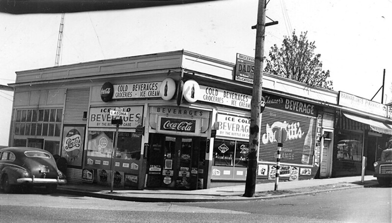
“65th and Latona, 1956” by Seattle Municipal Archives is licensed under CC BY 2.0.
Measuring a route’s access-based productivity involves creating a hypothetical transit network in which the route doesn’t exist. For the two routes in this installment of the series, elimination is anything but hypothetical. In preparation for the Lynnwood Link extension, King County Metro will be revising its transit service in North Seattle and Shoreline. Routes 20 and 73 are technically being replaced by new routes 61 and 77, not deleted. In reality, significant portions of their paths through Seattle are losing transit service entirely.
In my 12 years in Seattle, I’ve observed that Metro is reluctant to entirely remove transit service from corridors. The route serving a corridor may change, based on a desire to connect neighborhoods to different resources (typically new Link stations), but total elimination is a rare proposition. When initial plans have included route deletion, they are often walked back, at least in part. The cuts to routes 20 and 73 have survived the full public comment and county council approval processes.
I’m not categorically opposed to network changes that eliminate routes. Given the reality of a fixed budget, cutting a bad route is an opportunity to reinvest its service in good routes elsewhere. But transit routes don’t sport horns or halos to identify their level of virtue, if such a thing could even be measured definitively. Route productivity measurement, whether it uses ridership or access, helps make the decision less arbitrary.
Metro’s ridership-based measurements tell a clear story about these routes. They have poor ridership for the service hours invested. That is all that measurements of this nature can show; alone, they are an incomplete assessment of a route. Access measurements can evaluate a route’s potential to get people to destinations—valuable because ridership can fluctuate for reasons unrelated to the transit network. How well a route’s loss can be absorbed by the rest of the network also can be determined through access measurements, but not ridership ones. These are important factors, and commonly neglected. The story that the access-based measurements tell about routes 20 and 73 challenges Metro’s decision.
Route Journeys are the number of completed journeys in which the route is part of the fastest path between the origin and destination. Higher numbers are better, but I don’t consider this to be a useful measurement on its own. It’s a building block for other measurements.
| Route | Route Journeys (45 min) | Route | Route Journeys (30 min) | Route | Route Journeys (20 min) |
|---|---|---|---|---|---|
| E Line | 28,377,307,178 |
E Line | 6,292,756,511 |
E Line | 1,201,864,328 |
| 44 | 19,689,800,910 |
7 | 4,754,536,990 |
7 | 1,193,842,481 |
| 5 | 15,739,704,337 |
5 | 4,465,621,537 |
5 | 991,394,672 |
| 7 | 14,398,892,846 |
44 | 4,214,052,659 |
36 | 911,498,106 |
| 36 | 11,530,932,638 |
36 | 3,764,192,714 |
44 | 730,981,871 |
| 49 | 6,756,752,573 |
28 | 1,576,550,802 |
28 | 345,350,872 |
| 20 | 5,817,308,633 |
49 | 1,507,214,590 |
20 | 305,366,410 |
| 14 | 5,740,919,275 |
20 | 1,486,678,823 |
49 | 303,723,403 |
| 28 | 5,552,200,124 |
14 | 1,384,882,908 |
14 | 285,371,667 |
| 70 | 5,107,978,566 |
70 | 1,093,194,684 |
2 | 273,933,357 |
| 3 | 3,742,123,871 |
3 | 972,740,466 |
3 | 262,988,772 |
| 2 | 3,528,086,836 |
2 | 958,885,815 |
70 | 207,699,362 |
| 1 | 3,436,900,336 |
73 | 829,111,751 |
73 | 206,776,294 |
| 4 | 2,908,369,843 |
4 | 774,856,324 |
4 | 206,374,589 |
| 43 | 2,683,333,758 |
1 | 700,897,422 |
1 | 172,353,188 |
| 73 | 2,546,975,314 |
12 | 578,835,000 |
12 | 167,408,794 |
| 10 | 2,055,624,194 |
43 | 566,180,334 |
13 | 118,378,786 |
| 12 | 1,793,705,356 |
10 | 458,005,983 |
43 | 110,494,348 |
| 13 | 1,729,648,532 |
13 | 415,950,524 |
10 | 103,687,116 |
The Journeys per In-Service Second account for these routes having varying in-service time. Higher is better.
| Route | Journeys/In-Service Second (45 min) | Route | Journeys/In-Service Second (30 min) | Route | Journeys/In-Service Second (20 min) |
|---|---|---|---|---|---|
| 44 | 47,795 |
5 | 11,747 |
5 | 2,608 |
| 5 | 41,403 |
28 | 11,306 |
28 | 2,477 |
| 43 | 40,002 |
44 | 10,229 |
73 | 1,977 |
| 28 | 39,818 |
E Line | 8,767 |
44 | 1,774 |
| E Line | 39,533 |
43 | 8,440 |
36 | 1,751 |
| 73 | 24,354 |
73 | 7,928 |
E Line | 1,674 |
| 49 | 22,968 |
36 | 7,233 |
43 | 1,647 |
| 36 | 22,156 |
7 | 6,200 |
7 | 1,557 |
| 14 | 20,719 |
49 | 5,123 |
20 | 1,037 |
| 20 | 19,746 |
20 | 5,046 |
49 | 1,032 |
| 7 | 18,775 |
14 | 4,998 |
14 | 1,030 |
| 1 | 16,862 |
1 | 3,439 |
12 | 942 |
| 70 | 11,742 |
12 | 3,257 |
1 | 846 |
| 4 | 11,448 |
4 | 3,050 |
4 | 812 |
| 10 | 10,869 |
2 | 2,643 |
2 | 755 |
| 13 | 10,677 |
13 | 2,568 |
13 | 731 |
| 12 | 10,093 |
70 | 2,513 |
3 | 679 |
| 2 | 9,726 |
3 | 2,510 |
10 | 548 |
| 3 | 9,655 |
10 | 2,422 |
70 | 477 |
Replaceable Journeys are the number of journeys featuring a fastest path that includes the route, but still could be made within the time budget with that route eliminated. It can be made with a different combination of transit routes and walking. A lower number signifies higher performance, but, like the route journeys measurement, there is no accounting for the service investment. A route may have a lower number here not because it is inherently irreplaceable, but simply has fewer journeys to lose. Thus, I consider this to be another building block.
| Route | Replaceable Journeys (45 min) | Route | Replaceable Journeys (30 min) | Route | Replaceable Journeys (20 min) |
|---|---|---|---|---|---|
| 13 | 1,430,885,654 |
43 | 320,296,206 |
43 | 51,026,680 |
| 12 | 1,469,759,893 |
13 | 320,869,223 |
13 | 66,750,279 |
| 10 | 1,689,669,258 |
10 | 346,874,124 |
10 | 67,018,591 |
| 43 | 1,798,920,722 |
12 | 414,933,053 |
73 | 82,460,902 |
| 73 | 2,100,788,181 |
1 | 507,715,008 |
12 | 86,300,470 |
| 4 | 2,336,399,347 |
73 | 508,420,854 |
70 | 91,866,079 |
| 1 | 2,550,687,802 |
70 | 561,013,470 |
1 | 100,467,307 |
| 2 | 2,825,097,323 |
4 | 568,506,173 |
4 | 117,285,518 |
| 3 | 2,936,686,177 |
2 | 684,545,135 |
49 | 120,844,310 |
| 70 | 3,565,395,158 |
3 | 696,107,637 |
28 | 128,173,958 |
| 28 | 4,250,468,148 |
49 | 820,399,793 |
14 | 135,525,025 |
| 14 | 4,326,975,252 |
14 | 842,421,729 |
3 | 146,412,160 |
| 20 | 4,547,996,748 |
28 | 873,930,129 |
20 | 147,152,517 |
| 49 | 4,823,628,747 |
20 | 935,879,833 |
2 | 151,833,945 |
| 36 | 8,737,068,647 |
44 | 1,846,813,750 |
44 | 268,660,101 |
| 7 | 10,694,700,184 |
36 | 2,072,729,096 |
36 | 331,694,995 |
| 5 | 11,543,298,480 |
5 | 2,270,017,974 |
5 | 345,910,337 |
| 44 | 12,123,605,461 |
7 | 2,648,775,563 |
E Line | 416,531,786 |
| E Line | 17,553,294,642 |
E Line | 2,726,596,110 |
7 | 461,426,803 |
One way to account for the level of investment is to look at the replaceable journeys as a proportion of the route journeys. This is the Percent Replaceable. Lower is better.
| Route | % Replaceable (45 min) | Route | % Replaceable (30 min) | Route | % Replaceable (20 min) |
|---|---|---|---|---|---|
| 44 | 61.57% |
E Line | 43.33% |
E Line | 34.66% |
| E Line | 61.86% |
44 | 43.83% |
5 | 34.89% |
| 43 | 67.04% |
5 | 50.83% |
36 | 36.39% |
| 70 | 69.80% |
70 | 51.32% |
44 | 36.75% |
| 49 | 71.39% |
49 | 54.43% |
28 | 37.11% |
| 5 | 73.34% |
36 | 55.06% |
7 | 38.65% |
| 1 | 74.21% |
28 | 55.43% |
49 | 39.79% |
| 7 | 74.27% |
7 | 55.71% |
73 | 39.88% |
| 14 | 75.37% |
43 | 56.57% |
70 | 44.23% |
| 36 | 75.77% |
14 | 60.83% |
43 | 46.18% |
| 28 | 76.55% |
73 | 61.32% |
14 | 47.49% |
| 20 | 78.18% |
20 | 62.95% |
20 | 48.19% |
| 3 | 78.48% |
2 | 71.39% |
12 | 51.55% |
| 2 | 80.07% |
3 | 71.56% |
2 | 55.43% |
| 4 | 80.33% |
12 | 71.68% |
3 | 55.67% |
| 12 | 81.94% |
1 | 72.44% |
13 | 56.39% |
| 10 | 82.20% |
4 | 73.37% |
4 | 56.83% |
| 73 | 82.48% |
10 | 75.74% |
1 | 58.29% |
| 13 | 82.73% |
13 | 77.14% |
10 | 64.64% |
Another would be to simply look at the number of journeys that could not be replaced in proportion to in-service time, the Lost Journeys per In-Service Second.
| Route | Lost Journeys/In-Service Second (45 min) | Route | Lost Journeys/In-Service Second (30 min) | Route | Lost Journeys/In-Service Second (20 min) |
|---|---|---|---|---|---|
| 44 | 18,366 |
5 | 5,775 |
5 | 1,698 |
| E Line | 15,079 |
44 | 5,746 |
28 | 1,557 |
| 43 | 13,184 |
28 | 5,039 |
73 | 1,189 |
| 5 | 11,039 |
E Line | 4,968 |
44 | 1,122 |
| 28 | 9,335 |
43 | 3,666 |
36 | 1,114 |
| 49 | 6,571 |
36 | 3,250 |
E Line | 1,094 |
| 36 | 5,368 |
73 | 3,066 |
7 | 955 |
| 14 | 5,103 |
7 | 2,746 |
43 | 887 |
| 7 | 4,830 |
49 | 2,335 |
49 | 622 |
| 1 | 4,348 |
14 | 1,958 |
14 | 541 |
| 20 | 4,309 |
20 | 1,870 |
20 | 537 |
| 73 | 4,266 |
70 | 1,223 |
12 | 456 |
| 70 | 3,546 |
1 | 948 |
1 | 353 |
| 4 | 2,251 |
12 | 922 |
4 | 351 |
| 3 | 2,078 |
4 | 812 |
2 | 337 |
| 2 | 1,938 |
2 | 756 |
13 | 319 |
| 10 | 1,935 |
3 | 714 |
3 | 301 |
| 13 | 1,844 |
10 | 588 |
70 | 266 |
| 12 | 1,823 |
13 | 587 |
10 | 194 |
Routes 20 and 73 may be candidates for deletion, but if every route with lower access-based productivity were in similar danger, then Metro would have a much smaller network!
Route 20
Route 20 connects Lake City with the University District. On its way between those points, it connects to the Northgate and U District Link stations. It was launched when the Northgate Link extension opened in October 2021 to serve as a replacement for route 26, which ran between Northgate and Downtown Seattle via East Green Lake and Fremont. With the Link extended, Metro replaced the routing to downtown with a connection to U District Station. The portion between Northgate and Lake City once belonged to route 75, which was shifted elsewhere.
From a ridership perspective, the new route hasn’t worked out. It’s in the bottom 25% for all of Metro’s measurements except riders per platform hour at peak.
| Time Budget | Route 20 Journeys | % of All Journeys | Journeys/In-Service Second |
|---|---|---|---|
| 45 min | 5,817,308,633 |
1.4346% |
19,746 |
| 30 min | 1,486,678,823 |
0.9863% |
5,046 |
| 20 min | 305,366,410 |
0.5700% |
1,037 |
The access-based measurements do not explain the lack of riders. Among the 19 routes that have been analyzed, it’s consistently mediocre, but never as terrible as the ridership numbers suggest that it could be. It ranks near the middle for 20-, 30-, and 45-minute time budgets, across journeys per in-service second, percent replaceable, and lost journeys per in-service second. The first measurement indicates that the design of the route does help riders reach destinations. The latter two suggest that the lack of patronage is not a matter of alternatives being provided by other routes. This is not a meritless route among its peers, and its riders will not have copious alternatives when it’s gone.
I suspect that the ridership problem is the residue of bad timing, not design. Route 20 was launched at a time of pandemic-related losses of ridership. It improved frequency on the corridor that it inherited from route 26, but did so when, for many, expanding one’s use of transit was not a consideration. In May of 2023, as overall transit ridership was recovering, its service was halved to no better than 30-minute headways. There was little time for riders to take advantage of actually good service in this corridor. A rider acclimated to commuting downtown on the pre-pandemic 26, and returning to transit now, would find that their path involves catching a less frequent route and transferring. Do that to any route and I’m sure its ridership will suffer too.
| Time Budget | Replaceable Journeys | % Replaceable | Lost Journeys/In-Service Second |
|---|---|---|---|
| 45 min | 4,547,996,748 |
78.18% |
4,309 |
| 30 min | 935,879,833 |
62.95% |
1,870 |
| 20 min | 147,152,517 |
48.19% |
537 |
To be fair, the access measurements model deleting the route, but that isn’t exactly what’s being proposed. Route 20’s putative replacement connects Lake City and Greenwood, so only the portion south of North 85th Street will disappear. The access-based productivity measurements are per-route; it would be possible that its value predominantly comes from the remaining section. In that case, the replacement would be sensible, regardless of the overall productivity.
Instead, for a 30-minute time budget, the greatest decrease in mean score ratio is observed in sectors along the doomed corridor. While this is less extreme for the 20- and 45-minute durations, none of these measurements indicates that the deleted portion provides significantly less access value than the retained one. I suspect that the built environment plays a role, and that Metro may not understand how much it does. Route 67, with its frequent north-south service, isn’t far away, but there are several areas where the lack of an Interstate 5 crossing hinders reaching it.
If freeing up in-service hours by cutting transit on a corridor where it would have the least impact was the goal, then Metro is off base. I suspect another motive. Metro has been toying with removing service from the Latona Avenue Northeast section of route 20 for years. I discussed this when route 20 was first proposed, and Metro planned the route to bypass all of Latona south of Northeast 50th Street, claiming that “service is negatively affecting residents.” This was changed in the final implementation of the route, but it’s a dark day when a transit agency openly acknowledges that it fears complaints from residents more than it values constructing a transit network that lets people conveniently reach all parts of the city. Route 20’s recent ridership numbers gave Metro cover to act on its cowardice.
Route 73
Route 73 was once part of a three-route team that connected the University District and Downtown Seattle with all-day frequent service, in a time before the Link reached north of downtown. Routes 71, 72, and 73 formed a frequent trunk, before branching off into various Northeast Seattle neighborhoods. Upon leaving the University District, route 73 went almost due north, taking 15th Avenue Northeast to the city limits. As the Link was extended, the route changed, first to connect to University of Washington Station instead of going downtown, and subsequently to veer off 15th Avenue Northeast to connect to Roosevelt Station. With all these changes, it’s gradually become a low-frequency route. Its headway is at best half-hourly, with hourly service being common. Ridership-based productivity is in the bottom 25% for all of Metro’s measurements, except peak riders per platform hour.
The access-based productivity is extremely variable across measurements and times. Route journeys per in-service second never rank lower than sixth, and improve as time budget decreases. Lost journeys per in-service second follow a stretched version of the same pattern, still peaking at third for a 20-minute budget, but dipping below the mean at 45-minutes. By percent replaceable, though, route 73 bests only route 13 at the 45-minute maximum duration, but it climbs to eighth for a 20-minute budget.
| Time Budget | Route 73 Journeys | % of All Journeys | Journeys/In-Service Second |
|---|---|---|---|
| 45 min | 2,546,975,314 |
0.6281% |
24,354 |
| 30 min | 829,111,751 |
0.5500% |
7,928 |
| 20 min | 206,776,294 |
0.3859% |
1,977 |
Reasoning about a result like this is not straightforward. In the previous post, route 70 followed an opposite pattern: much better ranking in percent replaceable than the per in-service second measurements. I speculate that the contrasting points can be synthesized into some overall property of the route.
In isolation, I would expect route 73 to effectively contribute to a transit network’s access. Its stop spacing is not too tight—especially between Lake City Way Northeast and Pinehurst Way Northeast—meaning that it burns fewer service hours. Its stops have large walksheds, as there are few interruptions to the street grid in its immediate vicinity. There are multiple opportunities for connecting to east-west bus routes, as well as the Link. The sections of its route that it shares with others is mostly to facilitate the latter. These characteristics will boost it in the journeys per in-service second measurements.
Percent replaceable, on the other hand, seems better at assessing a route in context. If route 73 did not exist, other routes could pick up the slack, particularly for long time budgets. Route 67 is often no more than two short blocks away, and becomes more viable the more time that can be expended on walking. The Link can be used to jump quickly between locations on its path, with additional walking and transferring replacing one-seat route 73 rides. The routes around it restrict how much its access-enabling characteristics can add to the overall network.
| Time Budget | Replaceable Journeys | % Replaceable | Lost Journeys/In-Service Second |
|---|---|---|---|
| 45 min | 2,100,788,181 |
82.48% |
4,266 |
| 30 min | 508,420,854 |
61.32% |
3,066 |
| 20 min | 82,460,902 |
39.88% |
1,189 |
So if route 70 has intrinsic limitations but few alternatives, route 73 has beneficial characteristics, but makes limited unique contributions. The replaceability makes me somewhat more sympathetic towards Metro’s elimination of it, though its performance at lower time budgets is better than I anticipated.
That goodwill is diminished when comparing where 30-minute access is being lost, and which parts of route 73 are retained by the new route 77. Route 77 is long and complicated to describe, but the portion that it inherits from route 73 stretches from U District Station to the intersection of 15th Avenue Northeast and Lake City Way Northeast. The geographic breakdown of lost access for a 30 minute time budget indicates that the retained portion contributes far less than the deleted part.
This property is also present for the 20- and 45-minute durations. The reason for this is clear. There is an abundance of transit service running between the University District and Roosevelt Station. Route 45 takes a nearly identical path. Route 67 is not far away on Roosevelt Way Northeast. Those routes don’t materially change in the restructure, and aren’t overcrowded today1. Yet more service is being added, since route 77 will approximately double route 73’s frequency. While boosted frequency will increase access, there are diminishing returns when more service is added over the same path. At a time when parts of routes that are improving access more are being deleted, why allocate more where it will help the least?
Thinking About the Results
Looking solely from the perspective of access-based route productivity, routes 20 and 73 are fairly unremarkable. Within the sample, route 20 defines mediocrity. Route 73 has some interesting variation across measurements and time budgets, but is rarely extraordinary in either direction. These measurements suggest there are plenty of other routes that warrant greater scrutiny. Yet, in September, King County Metro will replace routes 20 and 73, and justify it with their poor ridership-based productivity.
I may think that Metro’s service allocation priorities are tremendously unsound, and sometimes I’m disgusted at what Metro’s view of the fundamental mission of public transit service seems to be. I can put those aside. This post isn’t the venue for asking for big changes—there’s plenty of that elsewhere. For the purposes of a restructure that’s months away, I’m not asking Metro to fundamentally change how it operates.
This exercise has convinced me that Metro’s upcoming restructure has correctable problems, but the agency can’t see the forest for the trees. The way Metro’s outreach materials are structured, the agency seems fixated on what each route—present and future—is doing or will do as an individual entity. The guiding question seems to be “can a lot of people starting along the course of each route use it, and maybe the Link, to reach things that people generally like and need?”
But routes shouldn’t be Metro’s products; Metro’s product is its network. Ridership-based route productivity measurements give Metro no way to see network-level effects. When deciding the fate of a route, Metro must do more than establish that few people are impacted. How effectively the people that were using the route can still reach their destinations with the remaining service matters, and it should influence which routes are deleted. I wish I had these results available during Metro’s restructure planning process. I could only hope that Metro is capable of adding a small piece of new information to its typical patterns. Perhaps different decisions would have been made.
-
Metro’s 2023 System Evaluation states that no routes met the overcrowding threshold. ↩︎