“Entering King County on WA SR 410” by Joe Mabel is licensed under CC BY-SA 3.0.
I grew up in Massachusetts. When I go back and spend a day in “Boston”, it might actually involve being in Brookline, Cambridge, Medford, Somerville, Chelsea, Everett, and Revere. That is not my relationship with Seattle and the municipalities around it. Sometimes I don’t leave its boundaries for months at a time. Much of what I need and want to do is located within the city limits. That’s not true all the time, but it’s true often enough that it heavily influences the way that I think about measuring transit access in Seattle. I presuppose that a person in Seattle mostly cares about getting around Seattle. The access analyses of the city that I produce measure the ability to do that.
Making trips within Seattle is, of course, not everyone’s priority all of the time. Looking at access at the city level is also a somewhat awkward way to analyze transit in this area. Seattle does not run or plan the transit service located within it. It provides some funding and participates in the planning process, but most transit in the city is under the purview of King County. Sound Transit, operating the Link Light Rail, exists at the level of a multi-county consortium. City-level access analysis feels like the most instructive tool for evaluating everyday transit quality, but it’s unlikely to be the most relevant tool for the agencies making the decisions. Recognizing that, I produced a thirty-minute transit and walking access analysis for King County. I feared this would be impractically slow and expensive—a fear that was neither entirely born out nor totally meritless. There are caveats to calculating and considering access for the county that are not exposed at the city level.
King County is Big
Producing an access analysis is neither free nor instantaneous. It consists of finding, for each sector, which other sectors can be reached within a duration bound at every minute of the day. The current map of Seattle that I use has 32,470 sectors. The time to compute each sector is variable; sectors near a denser walking path network and with more transit service nearby will take longer to compute. The average time, taking into account both the path finding itself and processing and storing of its results as useful measurements, is somewhere between five to 15 seconds. If each calculation were performed sequentially, this would take upwards of 45 hours. A standard desktop computer would do better than purely sequential calculation, but to get results even faster, I distribute the computation across up to 5,000 worker systems. These are each paid for by the second, but the small added cost means getting results in a few minutes, not days. The cost for a map of Seattle comes out to tens of dollars. The short time and low cost make it compelling to produce a new map whenever King County Metro changes transit service, or to test small changes to routes.
Comprising 292,594 sectors, the size of King County changes the equation. Even with the 5,000 workers, the time span to finish the computation is closer to a couple of hours than a couple of minutes. I could allow more simultaneous workers to lessen the time, but the issue of increased cost remains; it exceeds $100. I doubt this would be a significant impediment if an agency wanted to run an analysis, but as an unpaid, independent researcher it is much harder to justify frequently running county-wide analyses at this price.
“King County Metro 105” by raggiesoft is licensed under CC BY-SA 2.0.
The best solution to the time and cost issue would be to just make the per-sector computation faster. This is something that I have been steadily improving since 2016, when the analysis of Seattle, with less precision than the present 80 meter square sectors, would take longer than a day. Most of the low-hanging fruit for optimization has been picked.
An alternative approach is to avoid recomputing the whole analysis in response to network changes. For those that strictly remove transit service, route deletions and truncations, this is a matter of collecting all the sectors that have that route in any of their fastest paths to other sectors, and re-running the analyses just on them. While I have considered implementing this, at the city level the breadth of geographic impact that many routes have is surprisingly wide. That limits the potential for performance improvement versus recomputing the whole network. Additionally, it is more difficult to determine which sectors will need to be recomputed when new service is added, since the new service might be useful outside of the sectors in which it is immediately located. I suspect some systematic way of narrowing down what needs to be recomputed does exist. If it can reduce the number of sectors sufficiently, that, on top of the known method of dealing with deletions and truncations, will make experimenting with county-level modifications a much more feasible endeavor.
Whether through faster recomputing or narrowing the scope of recalculations, there is considerable upside to computing county-level modifications cheaply and quickly. Even if my inclination is towards making changes in Seattle, those changes are going to affect what people living in the surrounding municipalities can reach. That should be measured. A fair critique of the Seattle transit restructure that I previously proposed is that it removed the duplicative, in-Seattle portions of some express routes from the suburbs without understanding the full impact that this would have. If the analysis of the restructure were conducted at the county-level, those routes would be changed to connecting to transfer points in Seattle rather than being eliminated. This would more accurately measure the impact of the restructure, both inside and outside the city.
King County is Discontinuous
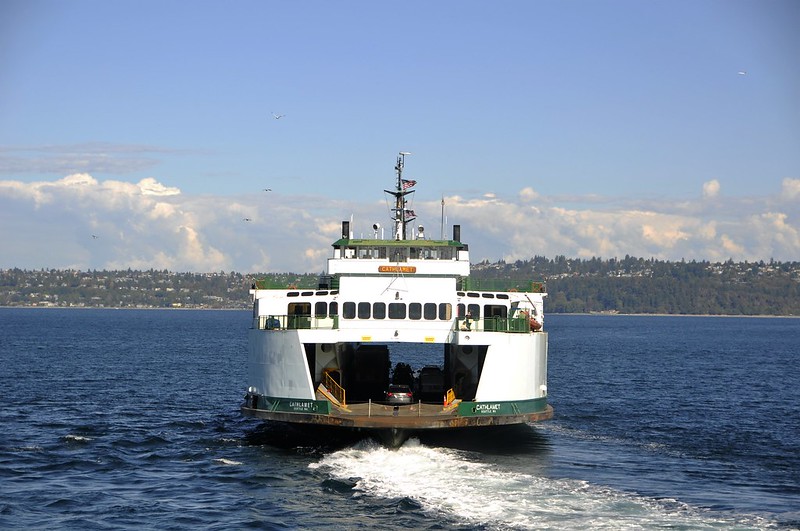
“Washington State Ferry Cathlamet Departing Vashon Island” by JoeInSouthernCA is licensed under CC BY-ND 2.0.
Something is missing in this access map. Vashon Island is part of King County, with a couple of Metro bus routes serving it, but it is entirely excluded from the calculation.
This is not intentional, but a side effect of how maps were processed into sectors at the time the analysis was conducted. Map data is sourced from OpenStreetMap. While the maps are generally reliable, when constructing sectors for Seattle, I’d occasionally see ones that appeared disconnected from the main map, typically near the waterfront. A sector is produced wherever OpenStreetMap indicates that there is a pedestrian-accessible, publicly-accessible road or path. I found there were docks and service roads, disconnected from the main map, that were flagged as accessible. To prevent these from interfering with the measurement, I changed sector creation to only generate sectors overlapping with the largest group of connected roads, rather than any road. For most areas, this works fine.
Seattle is continuous from a pedestrian perspective, but King County, as it includes an island, is clearly not. For the latter, this mechanism fails to produce a complete map. Consequently, I’ve updated map creation to work in two phases. The first produces all the connected groups of paths; the second allows the user to specify which groups they want to use for sector creation. The next map of King County will include Vashon Island because when making the map, I’ll be able to specify that I want to generate sectors from the two largest groups.
King County is Varied
When I use access analysis to evaluate a transit agency’s network, I mostly want to understand how well the agency serves the area that it intends to serve. In the case of King County Metro, I’ve struggled to understand what the intended service area actually is. Is this defined in law, or a matter of agency policy? I’ve read through some of Metro’s planning documents, trying to find some definition of one, to no end. I doubt that providing fixed-route transit to every walkable part of the county is a goal, given that this includes trails up mountains and isolated 100-person towns. With this lack of information, I measure using that unlikely premise—that King County Metro’s mission is to improve the ability to access every part of the county.

“Granite Mountain, King County, WA” by Omalmin is licensed under CC BY-SA 3.0.
In this analysis of King County, there are 123,280,198,323,840 possible journeys, or combinations of origin, destination, and departure time. It is possible to complete 510,765,058,387 of them using walking and transit in under 30 minutes, or 0.41%. For analyses of Seattle exclusively, this number generally has been around 10%. That King County’s average is far lower is not a surprise. There are nine-times the number of available sectors, and this increase is factored twice into the number of possible journeys. Given the same amount of time to travel, of course a much smaller portion of the area is going to be reachable from a given sector. That’s not the whole explanation, though.
The spatial distribution of access provides insight that the average can’t. Seattle’s per-sector access is roughly normally distributed, like that of the other cities that I have analyzed. As illustrated in this 50-bin histogram of the number of other sectors that can be reached per sector, King County’s is not.
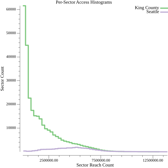
Expanding the scope beyond Seattle adds many sectors that are comparatively hard to get to. Seattle has the greatest amount of transit investment in the county, but It doesn’t have a monopoly on it. The downtowns and transit centers of some of the suburbs have access levels that rival parts of Seattle. For a lot of the county, though, transit is a total non-factor. It is possible to look at every sector and determine whether any of the ability to reach other sectors is the result of transit service. For 45.8% of sectors, transit confers no benefit whatsoever for 30-minute trips. That contributes to their relatively low access.
Some of the new sectors would be hard to reach regardless of transit infrastructure. There are plenty of sectors that are along dead-end paths up to summits of mountains, or otherwise geographically isolated. While the existence of remote places shouldn’t surprise anyone familiar with the geography and population distribution of King County, I was surprised by the amount. I was not expecting the distribution to be utterly dominated by hard to reach sectors.
Compared to Seattle, King County has far more varied transit investment and road network connectivity. Consequently, transit access reaches lower lows than it did in any analysis of Seattle. I don’t think that this is the wrong move for Metro, but I worry that this undersells the ability to rely on transit in the county. Places with strong transit access get lost when averaged together with the large swaths of the county where transit has no impact. This matters because measurements often get used to build narratives. A rate of completed journeys comfortably below one percent doesn’t credibly tell a decision maker that there are places where transit works well. The ways that I have presented access in the past break down when describing an area like King County.
Is King County Worth Analyzing?
I made an access map of King County mostly to understand whether my software could credibly work over a much larger area. From that perspective, this was a worthwhile experiment. Everything worked predictably from a technical standpoint. Scaling up the scope of work done by a complex system often exposes new problems within it, but that was not the case. Unfortunately, the time and cost of computation grew in the same predictable ways, and are high enough to dissuade me from regularly running calculations over an area this large.
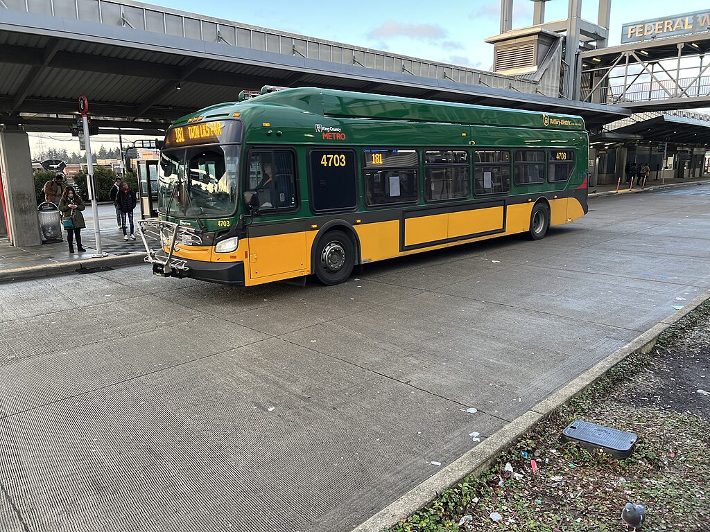
“King County Metro 4703” by AmaryahJohnson1996 is licensed under CC BY-SA 4.0.
I would accept the cost, though, if a county-wide measurement were particularly useful. As of now, the only compelling application that I see is the analysis of wide-ranging transit network changes. The restructure that I proposed for Seattle falls into this category; it modifies routes throughout the city in ways that affect those outside of it too. After conducting this analysis, I would need to think about how I would frame the access change. The average change at the county level would likely be minuscule. Computing the access for the whole county, but aggregating the per-sector change over only some subset, would help avoid dilution of the measurement. Taking this a step further, it would be possible to consider the access change only of sectors that were reached in new ways. These two approaches are far more likely to communicate a useful message about how riders lives will change as a result of broad transit network modifications.
Another approach—one that would also ameliorate the issue of cost—would be to stay at the municipality level, but to construct maps containing multiple cities or towns. It’s possible to measure access within the combined boundaries. This could create units of analysis that may better capture where a person would regularly like to go, if the idea of staying in a single city seems unrealistic and constraining. Unfortunately, it is currently difficult to bring unincorporated areas of the county into these combined maps. Some of these parts, such as White Center, are populous and well-served by transit. For some areas of the county, though, this approach would be viable.
Mostly, I expect that I will continue to operate at the city scope. Access maps of cities are more economical and seem more revelatory than the equivalent for King County. Knowing that it is possible to run the full-county analysis, though, is very useful. If the whole county can be analyzed, any of its component parts can too. This opens up new possibilities for more extensive access maps, though the best ways to communicate information from them have yet to be determined.