Due to a computational error, the data and conclusions in this post may not be accurate.
“Railroad terminals Northern Pacific – Great Northern – Chicago Milwaukee, St. Paul, and Pacific and Union Pacific, Seattle, Washington” by Boston Public Library is licensed under CC BY 2.0.
Trip planning is not the purpose of these access analyses, though. My goal in conducting them is to highlight ways in which transit is, and isn’t, effective in connecting origins and destinations. This is done with the thought that the results can inform attempts to restructure public transit networks, allowing access to more destinations more often. When the matter of what some hypothetical normal rider is willing to do creeps into access measurement, I believe that its efficacy in guiding restructures is actually diminished.
A rider’s prior experiences with transit will shape what they believe is possible, but if a transit network is changed, I see no reason to believe that riders won’t adjust their behavior. The aforementioned reader has largely ridden low-frequency suburban buses. That’s going to lead to different biases than those of someone accustomed to nearby, frequent, grade-separated transit. As a person in the latter situation, I will sometimes take a transit trip that route planning tools don’t find. Amidst a trip where I am on one vehicle, I will notice a transfer opportunity that emerges when a vehicle on another route is running late; sometimes this allows me to reach my intended destination faster. From the reader’s experience, an access analysis that suggests multi-seat rides overstates what is possible. For me, that analysis is neither a floor nor ceiling of what I can reach with transit on a given day. It is a locus around which my daily transit experiences will cluster. I have little doubt that if the reader in question were to live in an area where the transit network was different, those feelings and behaviors would shift over time.
From what I see of the transit agencies serving Seattle, accounting for rider behavior and preference is a significant, and often mandated, part of the route planning process. I find that problematic; agencies are soliciting the opinions of people who have adapted to the transit that they are currently using. The actions taken are going to be inherently conservative, because they are asking people to evaluate something unfamiliar against something that they have learned how to use. It’s an intentional choice that I focus on a computationally demanding, but rote, calculation of transit network capability, instead of the nebulous and changeable nature of rider experience and behavior. I believe that it allows for greater and faster improvement of transit networks.
From that perspective, the first step in building a better transit network is to understand the nature of access throughout it. My previous analyses have focused on that in Seattle, whether that’s highlighting surprising findings in the list of the most transit-accessible places, or a examining the difficulty of accessing a specific neighborhood or type of destination. The next step is to understand how access measurements of an area fit into a broader context. Inspired by a recent trip from Seattle to Chicago on the Amtrak Empire Builder, I conducted 30-minute access analyses for a typical weekday in those two cities, as well as the intervening major ones: Spokane, Fargo, Minneapolis, Saint Paul, and Milwaukee. Of course, the access measurements won’t capture everything about the experiences of transit riders in these cities. That’s ok, perhaps even preferable, when thinking of transit networks and rider behavior as malleable things. It does capture what I assert is the dominant force in shaping each individual’s version of their daily transit experience. The cities reveal themselves to be quite different in several access-derived measurements. Seattle’s transit providers perhaps should reflect on whether their current practices are causing its transit network to lag behind.
| City | Access Map—Walk Only | Access Map—Walking and Transit | Access Map—Comparison |
|---|---|---|---|
| Seattle | Link | Link | Link |
| Spokane | Link | Link | Link |
| Fargo | Link | Link | Link |
| Minneapolis | Link | Link | Link |
| St. Paul | Link | Link | Link |
| Milwaukee | Link | Link | Link |
| Chicago | Link | Link | Link |
Comparing Investment
“Seattle transit + ORCA Lift billboard” by SounderBruce is licensed under CC BY-SA 2.0.
It is easier to use public transit when vehicles arrive more frequently and cover more area. The choices around the allocation of service may be of differing quality, but investing in more service is never a bad choice for improving access.
To compare transit investment, just looking at the in-service vehicle hours of transit alone is insufficient. For a smaller land area, less transit service is required to provide connectivity between origins and destinations. If there were an area where all points were within a 30-minute walk of each other, no amount of transit would add value, according to this metric. None of the cities on the Empire Builder route are like this, but their sizes do vary. I don’t want to penalize or reward cities just for being large or small, and I do feel it is reasonable to expect a transit investment proportional to area, if a city considers fixed-route public transit to be a mode of transportation worth supporting.
The first step of my access analyses divides an area into a grid of uniformly-sized sectors. In these analyses, sectors are created by overlaying the city with a an 80 meter square grid, and including every sector of the grid that has at least one pedestrian-accessible road or path contained in it. The idea behind this is that the presence of a road or path indicates a place that people would want to be, because someone has made effort to construct a means to get there. This number of sectors serves as the indicator of size.
By making use of transit schedules, my analyses also compute the amount of transit service that is being run. I run access analyses at the level of a city, but a transit agency might exist at a level of government higher than the city in question. When this happens, transit routes might extend beyond the bounds of the city. To account for this, I look at every trip that runs during the day-long period for which the access analysis is run, but then remove stops from either end if they are no longer in the city’s area. For routes that leave and return to a city, I still count the time elapsed between exit and return. I can see the merits of leaving that out, but it complicates what seems to be an infrequent edge case.
For each of the cities, I divided the amount of transit service by the number of sectors to create an area-adjusted service measurement.
| City | Sectors | In-Service Time | In-Service Seconds | Service Seconds/Sector |
|---|---|---|---|---|
| Seattle | 32,470 |
5,883 hours, 19 minutes, 27 seconds | 21,179,967 |
652.29 |
| Spokane | 22,412 |
965 hours, 29 minutes, 59 seconds | 3,475,799 |
155.09 |
| Fargo | 13,179 |
231 hours, 47 minutes, 38 seconds | 834,458 |
63.32 |
| Minneapolis | 21,558 |
2,719 hours, 2 minutes | 9,788,520 |
454.06 |
| St. Paul | 18,284 |
1,323 hours, 23 minutes | 4,764,180 |
260.57 |
| Milwaukee | 35,532 |
3,012 hours, 9 minutes | 10,843,740 |
305.18 |
| Chicago | 80,245 |
13,813 hours, 45 minutes | 49,729,500 |
619.72 |
Seattle acquits itself well in transit investment. It tops the list of service seconds per sector, edging out Chicago. There is a significant range in the measurements, with Seattle’s per-sector transit investment exceeding Fargo’s by more than a factor of 10. Chicago makes the largest overall investment—not surprising given its large area.
Comparing Access
“Rapid transit plan, 1920” by Seattle Municipal Archives is licensed under CC BY 2.0.
It’s impossible to have useful transit without an investment in service, but not all service investments result in equally useful transit. From the perspective of a time-bounded access analysis, whether transit is “useful” has a specific meaning. My take on access analysis considers a collection of journeys: combinations of origin sector, destination sector, and start time of the trip. Each city has a fixed number of potential journeys, based on the number of sectors comprising it and the number of minutes in a day. The access analysis computes how many journeys can actually be completed under a time bound. For this multi-city comparison, the analysis is done twice: once only allowing walking, and again with the area’s transit in place for a typical weekday. A transit trip is “useful” when it allows a journey to be completed under the time bound, when that journey could not be made just with walking.
This obviously doesn’t cover every way that a transit trip can help a person reach a destination. There is value in reducing a 29 minute walk to a 10 minute transit ride that will not be reflected in the measurement. There could even be value in changing a 10 minute walk into a 15 minute transit trip, if a person is carrying something heavy. Furthermore, there is no reason to believe that a person will give up on getting to their destination if it is just a hair over 30 minutes away. A time bound merely reduces computational complexity and simplifies visualization by presenting the completion of a journey in a binary way; it’s not a statement about what people will consider doing. The idea is that if a transit network introduces many new 30-minute journeys to the walk-only environment, it probably adds many new 31-minute, 45-minute, or 1-hour journeys too. It is also likely to speed up the journeys associated with some 10-, 15-, or 30-minute walks. This is based on intuition; I have not yet verified this assumption. There may be ways that a network is optimized for enabling one duration of journey and subpar at others, but this does not reflect my experiences with transit. I’ve felt the opposite; I don’t use one set of transit routes for short trips and one for long trips, and as the transit network around me has changed, I haven’t found that improvements and degradations cluster around trips of a certain length. There is no single-point measurement for “useful” transit. Building one around transit’s core goal of connecting origins and destinations seems like a reasonable way to quantify the essence of whether a city’s transit improves the lives of riders.
For each of the cities, I computed access analyses with and without transit present. I also computed two measurements relating the results of these two analyses.
| City | Total Potential Journeys | Completed Walk Only Journeys | Walk Only Ratio | Completed Transit and Walking Journeys | Transit and Walking Ratio | Transit Increase Amount | Transit Increase Factor |
|---|---|---|---|---|---|---|---|
| Seattle | 1,518,193,296,000 |
73,825,081,920 |
0.049 |
151,980,436,789 |
0.100 |
0.051 |
2.059 |
| Spokane | 723,308,751,360 |
41,537,289,600 |
0.057 |
72,417,407,131 |
0.100 |
0.043 |
1.743 |
| Fargo | 250,107,899,040 |
22,938,239,520 |
0.092 |
27,028,786,665 |
0.108 |
0.016 |
1.178 |
| Minneapolis | 669,236,204,160 |
50,683,394,880 |
0.076 |
94,290,510,136 |
0.141 |
0.065 |
1.860 |
| St. Paul | 481,398,704,640 |
39,292,272,000 |
0.082 |
70,723,497,650 |
0.147 |
0.065 |
1.800 |
| Milwaukee | 1,818,033,154,560 |
79,381,267,200 |
0.044 |
189,240,779,221 |
0.104 |
0.060 |
2.384 |
| Chicago | 9,272,534,436,000 |
202,142,314,080 |
0.022 |
513,029,208,870 |
0.055 |
0.034 |
2.538 |
The Twin Cities of Minneapolis and Saint Paul are tops among overall 30-minute access, and that does not appear to solely be the residue of a better walking environment. The overall access is backed with the highest transit access amount increase. Meanwhile, Fargo manages an overall access score in line with the other cities, in spite of running far less transit than them. This seems almost entirely the consequence of its small number of sectors. Fargo acquits itself well by neither transit increase measurement; this is not a matter of figuring out a way to do more with less.
I find the discrepancies between the transit increase amount and the transit increase factor to be somewhat perplexing. I’m not sure if one is clearly a better representation of the capability of transit in the city, or if they are measuring improvement in different dimensions. Chicago, the winner in transit increase factor, is second worst in transit increase amount. Whichever improvement measurement one considers, Seattle’s scores are unexceptional. This stands in stark contrast to its superior transit investment.
Comparing Distribution
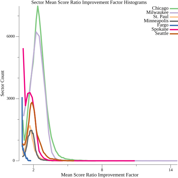
As discussed in Exploring Exceptionality, access is more than just a single number. Each sector has its own access score, based on the geometric mean of two components: the number of completed journeys originating from the sector, and the number ending at the sector. The overall access of the city aggregates the sector measurements, but it’s also possible to look at the distribution of access on a per-sector basis. That post showed per-sector access in Seattle to be roughly normally distributed, but at the time of that post, it was unclear whether this would hold generally. I constructed a 50-bin histogram of the per-sector access scores of each city. Rather than the more conventional bar chart, I graphed them as line charts to make it possible to see each city’s histogram when displayed on a single graph.
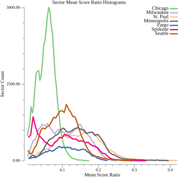
While the average access measurements for the cities cluster in a relatively tight range, there are a variety of shapes to the distributions. Most of the distributions of access appear roughly normal, like Seattle’s, though with a range of variances. Milwaukee and Spokane have pronounced bimodal distributions, though. With this sample of cities, I don’t see any large trends between the shape of the distribution and the overall access.
The only thing that I see remotely resembling a trend is that the top performing cities by overall access, Minneapolis and Saint Paul, have a similar shape of distribution. They have the widest ranges of the seven distributions, with long tails and more uniformity than most. This means that access is more varied sector-to-sector than in other locations. I find it interesting that cities served by the same transit agency have a similar distribution; perhaps it is an intentional choice made by the agency to allocate transit resources that way. In spite of these cities topping the access leaderboard, I’m not convinced that that is a product of the distribution. I see no reason at this point why average access and overall shape can’t be independent, and the results from the other cities don’t provide strong evidence of these being correlated.
I also considered the distribution of the access increases derived just by transit.

Fargo and Spokane have a substantial portion of sectors where transit appears to confer little to no benefit over walking. These two cities also have the lowest overall absolute service hour investment. None of the other cities have a distribution like this, perhaps because of more substantial overall transit investments.
I also explored the long tail of Milwaukee’s improvement factor. A tail like this means there are some locations, possibly as few as one, that have outsized gains in the amount of access improvement factor. I’m most familiar with seeing this in an area like Seattle’s downtown, where a large number of transit lines converge. This is not the case in Milwaukee. Milwaukee has a jagged border. An area that should be easy to walk to is not, according to this analysis, because part of the road connecting it to the rest of the city is outside the city limits. It can be reached by a very indirect walk, leading to low access in the walking-only analysis. A bus route runs along this road, giving this area average transit access with respect to the rest of the city. This results in a large improvement factor, but its not the result of a transit-planning choice. Any measurement that is limited to a city is going to be flawed in some way; this measurement treats them as walled-off spaces that no one enters or leaves. Nevertheless, their governments are often the entities responsible for making transit-impacting changes. Their powers to improve transit will be limited outside of their borders. I don’t think there is a better entity to measure than cities, but, as the improvement factor graph in particular shows, measuring this way does create weirdness at the margins.
I don’t see much remarkable about the distribution of transit access. Seattle’s distributions of access and improvement with transit aren’t radically different than those of the other cities here.
Comparing Efficiency

“Rainy 3rd Ave & Bell St (southbound)” by Oran Viriyincy is licensed under CC BY-SA 2.0.
Generally, I find efficiency to be unduly revered. Efficiency often invites fragility; all the redundancy removed from a system can be sorely missed when a part of the system fails to behave as expected. Nevertheless, I think there is value to have an efficiency component in measuring transit access. A reality of running transit service is that it will be constrained by a budget. The purpose of delivering access with fewer in-service hours is to invest those hours elsewhere, making new journeys possible. A comparative measurement of efficiency in access can identify agencies whose network planning practices may be worth emulating.
I built an efficiency measurement from two components already discussed: the number of journeys added by running transit and the number of in-service hours making up the transit trips. The measurement is the former divided by the latter.
| City | Transit and Walking Journeys | Walk Only Journeys | Added Journeys | Service Seconds | Journeys Added per Service Second |
|---|---|---|---|---|---|
| Seattle | 151,980,436,789 |
73,825,081,920 |
78,155,354,869 |
21,179,967 |
3,690.06 |
| Spokane | 72,417,407,131 |
41,537,289,600 |
30,880,117,531 |
3,475,799 |
8,884.32 |
| Fargo | 27,028,786,665 |
22,938,239,520 |
4,090,547,145 |
834,458 |
4,902.04 |
| Minneapolis | 94,290,510,136 |
50,683,394,880 |
43,607,115,256 |
9,788,520 |
4,454.92 |
| St. Paul | 70,723,497,650 |
39,292,272,000 |
31,431,225,650 |
4,764,180 |
6,597.41 |
| Milwaukee | 189,240,779,221 |
79,381,267,200 |
109,859,512,021 |
10,843,740 |
10,131.15 |
| Chicago | 513,029,208,870 |
202,142,314,080 |
310,886,894,790 |
49,729,500 |
6,251.56 |
Transit in Milwaukee adds nearly 2.75 journeys per service second than transit in Seattle. When talking with transit aficionados in Seattle, I never hear Milwaukee mentioned as a city to emulate. But Milwaukee has a similar—slightly larger—number of sectors, runs just under half as many in-service transit hours, and achieves about the same—but slightly better—30-minute access. That can’t be ignored.
From Comparison to Improvement
“Seattle downtown transit tunnel - IMG_1412” by Nicola since 1972 is licensed under CC BY 2.0.
As I was collecting these results, my biggest fear was that all cities extract about the same access gain from their transit. As an optimizer of systems in my professional life, and as a transit rider in Seattle, I’m excited by these results. The tireless work of transit advocates in Seattle—whose work is basically inscrutable magic to me—has yielded an exceptional level of investment. It looks like other cities are doing better in turning the investment into access. Just knowing that, even if it’s not clear how they’re doing it, is a useful piece of information. It means there’s a chance that reshaping Seattle’s transit network, even while treating the budget as a hard constraint, could yield vast improvements for the city’s transit riders. This is an optimizer’s dream.
Figuring out how will be a gradual process. Is there something about the bimodal distribution of access in Milwaukee and Spokane that makes their efficiency the top two of the group, or is that mere coincidence? There are also more traditional ways of looking at route planning that will be worth correlating with the access and efficiency measurements. Are Seattle’s transit vehicles slower, causing a large investment in service to return mediocre access? Can variation in access be explained solely by the distance between transit stops? The cause of deficient access may be entirely geographic; it might just be harder to run transit in a city shaped like Seattle. Having access analyses from multiple cities makes it possible to investigate these hypotheses. Each of them can be quantified and tested for their correlation with the access-derived measurements.
For the past seven years, I’ve been satisfied living car-free and making extensive use of transit in Seattle. In that same time, I have been a little disappointed that Seattle’s transit agencies, at least from the outside, appear to make service and route planning decisions based on the stated preferences and present day behavior of riders. In spite of that, the resultant transit network has always felt sufficient. After seeing these results, I can’t see the network like that anymore. The access analyses unambiguously show me a transit network with strong potential, but major inefficiencies. While I will endeavor to discover what a network that corrects this looks like, it’s all academic unless the agencies funding and operating transit in Seattle are willing to step outside their current processes and consider it. Are they interested in doing better?