“UW HUB Stop” by Oran Viriyincy is licensed under CC BY-SA 2.0.
This is a revised examination of a measurement of how individual transit routes contribute to overall access in Seattle. The first attempt was subject to a computational error that caused incorrect figures to be reported for certain routes. This iteration fixes that issue, and also uses updated schedules for King County Metro and Sound Transit that will take effect on September 14th.
The first version was presented in a series of parts. In each part, I chose a group of thematically similar routes and computed five measurements for them. I now find this approach to be somewhat clunky. These measurements don’t have clear “good” or “bad” values; they are only useful in comparison. Thus, it was difficult to meaningfully evaluate the routes chosen in the early part of the series. This revision presents all routes at once.
I’m also rethinking which of the five original measurements are meaningful. The goal of deriving them was to introduce an access component to route-level decision making. Like many agencies, King County Metro uses measurements based on ridership to assess how “productive” its individual routes are. Counting riders is surprisingly difficult, and is done by observing a sample of trips, while actual ridership varies day-to-day. Unweighted access-based measurements intend to capture the innate value of a route for connecting origins to destinations, at all times of day. They express capability—particularly unique capability that cannot be replaced by other routes—rather than an incomplete view of present-day use. As the last series progressed, I found route journeys per in-service second and percent replaceable to be most aligned with the concept of a “productivity” measurement. Route journeys per in-service second can be determined with a single access computation, but percent replaceable currently requires recomputing access in the absence of each route. This is expensive, and I want to invest in some strategies to speed up the calculation before revisiting it. In this installment, route journeys per in-service second will stand on its own. It adds a necessary dimension to the analysis of public transit routes, one that agencies are unwise to ignore.
The Measurement: Journeys Per In-Service Second
Route journeys are the number of completed journeys in which a route is part of the fastest path between an origin and destination sector, at a time of the day. Dividing this number by the in-service seconds spent to run the route within Seattle adjusts for the varying length and frequency of routes. The end result allows routes to be compared on their efficiency at making destinations available to any potential rider at all times of day. The table below shows these values for transit routes serving Seattle, given a 30-minute time budget.
| Rank | Route | Route Journeys | In-Service Seconds | Route Journeys Per In-Service Second |
|---|---|---|---|---|
| 1 | 65 | 5,042,274,815 |
333,178 |
15,133 |
| 2 | 75 | 5,191,760,406 |
384,180 |
13,513 |
| 3 | 5 | 4,508,256,378 |
359,760 |
12,531 |
| 4 | 28 | 1,912,719,596 |
165,000 |
11,592 |
| 5 | 67 | 3,071,230,925 |
273,300 |
11,237 |
| 6 | 79 | 958,843,694 |
86,220 |
11,120 |
| 7 | 50 | 4,446,041,874 |
411,780 |
10,797 |
| 8 | 21 | 3,528,123,434 |
333,540 |
10,577 |
| 9 | 61 | 2,632,581,113 |
251,760 |
10,456 |
| 10 | 22 | 479,739,030 |
46,080 |
10,411 |
| 11 | E Line | 6,333,394,849 |
644,099 |
9,832 |
| 12 | 128 | 2,196,241,137 |
234,346 |
9,371 |
| 13 | 45 | 3,754,698,343 |
403,140 |
9,313 |
| 14 | 31 | 1,791,155,797 |
193,140 |
9,273 |
| 15 | 32 | 2,060,733,186 |
223,500 |
9,220 |
| 16 | 372 | 2,809,115,247 |
312,578 |
8,986 |
| 17 | 40 | 6,257,027,845 |
714,240 |
8,760 |
| 18 | 131 | 1,376,789,215 |
158,952 |
8,661 |
| 19 | 107 | 2,734,051,511 |
316,366 |
8,642 |
| 20 | D Line | 5,202,852,929 |
609,000 |
8,543 |
| 21 | 348 | 819,536,785 |
96,061 |
8,531 |
| 22 | 106 | 2,880,973,119 |
339,561 |
8,484 |
| 23 | 44 | 3,627,271,603 |
439,860 |
8,246 |
| 24 | 43 | 516,726,035 |
63,120 |
8,186 |
| 25 | 48 | 2,781,635,211 |
340,440 |
8,170 |
| 26 | 62 | 4,861,270,672 |
598,171 |
8,126 |
| 27 | 33 | 1,007,155,879 |
125,700 |
8,012 |
| 28 | 365 | 785,925,135 |
98,338 |
7,992 |
| 29 | 24 | 1,256,454,264 |
163,080 |
7,704 |
| 30 | 522 | 875,308,922 |
114,700 |
7,631 |
| 31 | 36 | 3,788,986,468 |
517,680 |
7,319 |
| 32 | 124 | 1,579,326,702 |
224,220 |
7,043 |
| 33 | 8 | 2,589,303,313 |
377,880 |
6,852 |
| 34 | 125 | 1,043,028,512 |
167,700 |
6,219 |
| 35 | 132 | 1,197,650,217 |
192,762 |
6,213 |
| 36 | H Line | 2,849,781,972 |
464,574 |
6,134 |
| 37 | 7 | 4,683,812,966 |
811,860 |
5,769 |
| 38 | 60 | 3,437,194,075 |
632,880 |
5,431 |
| 39 | 773 | 171,678,987 |
31,740 |
5,408 |
| 40 | 49 | 1,252,630,035 |
243,780 |
5,138 |
| 41 | 14 | 1,370,370,567 |
276,180 |
4,961 |
| 42 | C Line | 3,498,863,562 |
721,200 |
4,851 |
| 43 | 345 | 666,352,099 |
142,740 |
4,668 |
| 44 | 57 | 79,880,673 |
18,720 |
4,267 |
| 45 | 17 | 85,755,780 |
20,220 |
4,241 |
| 46 | 12 | 528,081,887 |
129,000 |
4,093 |
| 47 | 27 | 380,546,915 |
97,980 |
3,883 |
| 48 | 988 | 23,292,014 |
6,000 |
3,882 |
| 49 | 775 | 102,455,660 |
26,880 |
3,811 |
| 50 | 630 | 24,549,391 |
6,499 |
3,777 |
| 51 | 9 | 119,832,302 |
33,780 |
3,547 |
| 52 | 542 | 93,429,317 |
26,400 |
3,538 |
| 53 | 1 | 689,236,732 |
203,400 |
3,388 |
| 54 | 11 | 732,592,504 |
216,540 |
3,383 |
| 55 | 255 | 161,835,956 |
48,708 |
3,322 |
| 56 | 556 | 20,944,520 |
6,840 |
3,062 |
| 57 | 984 | 10,749,329 |
3,780 |
2,843 |
| 58 | 545 | 318,391,580 |
113,234 |
2,811 |
| 59 | G Line | 933,942,772 |
339,600 |
2,750 |
| 60 | 56 | 40,888,344 |
14,940 |
2,736 |
| 61 | 113 | 48,244,656 |
17,977 |
2,683 |
| 62 | 70 | 1,120,018,403 |
420,420 |
2,664 |
| 63 | 4 | 1,328,112,910 |
504,360 |
2,633 |
| 64 | 10 | 377,785,784 |
144,240 |
2,619 |
| 65 | 2 | 918,293,164 |
360,720 |
2,545 |
| 66 | 3 | 411,410,993 |
164,820 |
2,496 |
| 67 | 13 | 398,117,246 |
160,740 |
2,476 |
| 68 | 311 | 12,243,908 |
5,254 |
2,330 |
| 69 | 101 | 325,178,795 |
142,920 |
2,275 |
| 70 | 177 | 23,522,236 |
10,860 |
2,165 |
| 71 | 333 | 69,738,408 |
32,287 |
2,159 |
| 72 | 322 | 93,435,369 |
44,231 |
2,112 |
| 73 | 150 | 352,092,789 |
169,380 |
2,078 |
| 74 | 257 | 9,347,362 |
4,555 |
2,052 |
| 75 | 102 | 42,150,938 |
21,420 |
1,967 |
| 76 | 994 | 14,427,015 |
8,100 |
1,781 |
| 77 | 162 | 10,141,861 |
7,003 |
1,448 |
| 78 | 554 | 127,136,189 |
88,620 |
1,434 |
| 79 | 271 | 51,947,178 |
57,000 |
911 |
| 80 | First Hill Streetcar | 204,529,308 |
231,000 |
885 |
| 81 | 987 | 8,083,446 |
9,900 |
816 |
| 82 | 212 | 12,220,638 |
16,860 |
724 |
| 83 | 982 | 2,226,323 |
3,180 |
700 |
| 84 | 303 | 7,699,148 |
11,520 |
668 |
| 85 | 111 | 5,476,751 |
9,480 |
577 |
| 86 | 550 | 33,342,004 |
70,260 |
474 |
| 87 | 218 | 3,087,412 |
6,780 |
455 |
| 88 | 986 | 1,351,168 |
3,180 |
424 |
| 89 | 193 | 5,482,365 |
13,658 |
401 |
| 90 | South Lake Union Streetcar | 41,443,217 |
107,040 |
387 |
| 91 | 973 | 3,862,681 |
23,400 |
165 |
| 92 | 989 | 327,079 |
2,340 |
139 |
| 93 | 981 | 0 |
480 |
0 |
A histogram illustrates the shape of the data, which gets lost in a massive chart. The 50-bin one below shows the distribution of route journeys per in-service second.
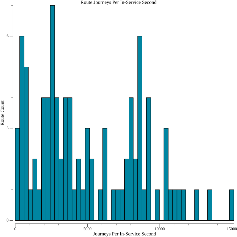
There may be some clustering around three modes, but I don’t feel confident proposing a statistical model for the data. It doesn’t appear to be normally distributed. This limits the utility that computing z-scores for each route would provide.
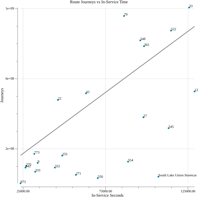
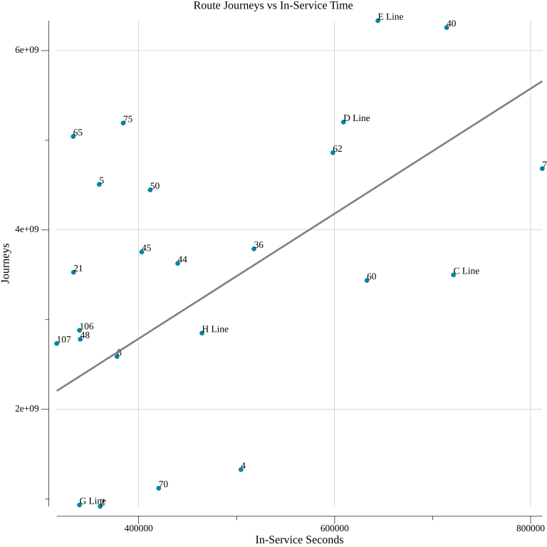
To further illustrate the range of outcomes for routes, I constructed scatter plots of route journeys versus in-service seconds. To avoid large clusters of overlapping points, I broke the routes into quarters based on their in-service time. The trend line in each of the plots is the overall mean route journeys per in-service second, not just that of the routes on the plot.
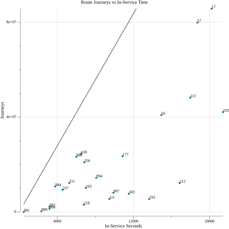
The routes with the fewest in-service seconds are never above average in route journeys per in-service second. This isn’t an intrinsic quality of low-investment routes, but is instead due to other shared characteristics. The routes in the 900s are school bus service, ostensibly open to the public, but intended for students. These generally make minimal stops within Seattle. Route 981 makes two stops in the city, serving parts of the private Lakeside School campus. The trip between them is faster by walking, though, since the time between stops accounts for a lengthy hold to load students. Therefore, it contributes no completed journeys, while accumulating a small amount of in-service time. The other school routes make some access contributions, but their performance relative to the average makes it clear that this is not their primary mission. The other broad classification of routes in this cluster are commute-centric ones that only make a few stops downtown and are not intended for intra-city trips. These routes rarely have exclusive pathways within Seattle, so they compete for journeys with each other and the many other routes serving downtown.
Routes 17, 56, and 57 are the only ones not fitting these categories. They are peak-only—to be expected given that these routes are in the lowest quarter of investment—but each serve areas of Seattle lacking other transit options. The access that they provide is diminished by some shared properties. As express routes between downtown and outlying neighborhoods, a portion of their in-service time is spent not making any stops. This allows them to reach those areas faster than a route that stops along the way could—which is good for access—but it’s not enough to offset the time spent without stops, where no journeys are gained. This is not an indictment of all limited-stop transit, though. The Link 1 Line is not shown on these plots because its top-ranked 19,805 journeys per in-service second break the scale. With dedicated right of way, it can get between distant areas quickly and unaffected by congestion. These rush hour buses running in mixed traffic fail to do this.
There is a greater diversity of performance in the second quarter, with some routes far above average in journeys per in-service second. Route 79 is among them, ranking sixth overall. It connects to two Link stations, providing access to several neighborhoods to the stations’ east. Its low in-service time is the product of mostly-hourly frequency. Metro’s own measurements of its productivity are unfavorable. It’s never had high frequency or weekend service, though, so its poor performance seems more the result of a schedule that discourages ridership than a lack of utility.
Route 22 is the 10th best route by journeys per in-service second. Its path forms an east-west bridge between the RapidRide C and H lines, and it serves a plateau that is otherwise disconnected from the street grid. It’s also highly unproductive by Metro’s measurements, though, and has been cancelled in the past. Conventional planning wisdom would justify its present hourly frequency. The access measurement makes the case that if it were a frequent route, its outsized ability to connect origins and destinations could induce increased use.
On the opposite end of the spectrum, the South Lake Union Streetcar is a particularly poor performer. As the fourth-to-last route in journeys per in-service second, it ranks among the school and commuter routes that aren’t intended for general trips within Seattle. Its course is entirely overlapped with other bus routes, all of which provide a closer connection to the Link downtown.
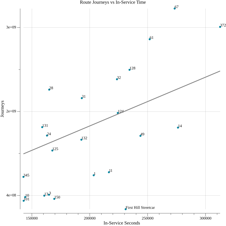
Some high performing routes appear in the third group, and they are rather varied. Route 28—ranked fourth overall—connects Downtown Seattle with primarily-residential neighborhoods to the north. It intersects with a variety of east-west routes for transfer opportunities, and isn’t too close to other north-south routes. Route 67 serves points between the U District, Roosevelt, and Northgate Link Stations. This affords it the fifth-best route journeys per in-service second within Seattle. Route 61—ranked 9th—has been added in the upcoming service change. It will create new connections between Greenwood and Northgate Station, and between Lake City and the north-south routes to the west of Interstate 5.
The First Hill Streetcar provides a corroborating datapoint for the ineffectiveness of Seattle’s streetcar program. Both streetcar routes have considerable overlap with well-used, frequent bus routes. With no major transit priority features, the streetcar moves no faster than the buses with which it shares road space. This yields an amount of new journeys disproportionate to the service investment. The First Hill Streetcar’s better performance is likely derived from the nearly-exclusive path it has on parts of Broadway. The lack of coordinated route planning between agencies, or perhaps a misguided belief that overlap is justified because different riders have a strong affinity for one mode or the other, has borne disappointing results.
Routes 3 and 13 are among the lowest-ranked bus routes that provide service exclusively within Seattle. Route 13’s service between downtown and Seattle Pacific University contains only a few blocks of non-overlapping service. There are many variants of route 3—the longest of which runs from Madrona to downtown to Summit—that get combined into a single measurement. Depending on which version of the route a trip runs, it may have considerable or minimal concurrency with other routes. Overlap is not the only driver of substandard access, but it’s a major one. I’m therefore surprised how comparable its measurements are with those of route 13.
Routes 65 and 75 have the first and second most journeys per in-service second. Both serve northeast Seattle and connect to Link stations. They are fairly distant from other north-south routes. They also provide transfer opportunities at the northern and southern ends of their routes, but surprisingly few in between given where they rank. Route 65 may have an edge due to its better walkshed, since route 75 runs closer to Lake Washington and has a limited amount of land to the east of its routing.
Most trips on route 5—ranked fourth—and route 21—ranked eighth—are through-routed. Unless the bus is going out of service, the route number flips as it approaches downtown: from 21 to 5 if coming from the south, or 5 to 21 when arriving from the north. Going through downtown is a net-detriment to route journeys per in-service second, since in-service time is being spent in an area where there is heavy competition for journeys. Being through-routed means that each route experiences half the penalty, since few route 5 trips go south through downtown, and few route 21 go north though it. This may explain how these routes score better than the not through-routed RapidRide E and C lines, to which they are otherwise quite similar.
Route 50 ranks seventh. One of the few routes serving West Seattle that does not make a beeline for downtown, it connects to three Link stations. It is also one of the few east-west options in the Rainier Valley, and thus connects to many north-south routes.
“KCM 4505 on Rainier Avenue” by SounderBruce is licensed under CC BY-SA 2.0.
Route 7 has the greatest amount of in-service time of any route in Seattle, but its position under the trend line indicates a relative inefficiency in converting investment into opportunity. Between downtown and Mount Baker Station, it shares its path with a litany of other routes, likely weighing it down.
King County Metro’s RapidRide lines are Bus Rapid Transit. They run with high frequency, using a relatively large amount of in-service hours that puts them in the upper quarter of routes. The lines also involve some amount of dedicated right-of-way, transit priority features, and stations with off-board payment to allow all-door boarding. Features like these should allow higher-speed, shorter-dwell operations that would make these routes a part of more journeys. In reality, they vary considerably in route journeys per in-service second. None of them are among the top ten most efficient in providing access, possibly because they are all downtown-centric. The E Line ranks 11th. The D Line is also above average. The below-average C and H Lines suffer from the same problem plaguing the aforementioned routes 56 and 57; they spend a significant portion of their routing getting to West Seattle while making no stops. The yet-to-debut G Line spends the least time traversing downtown, but it is among the least efficient of any of Metro’s bus routes. I suspect it may be due to close proximity to route 2. King County Metro’s service revision altered a number of routes in its vicinity, but surprisingly did not include any changes to route 2. As a result, neither route efficiently delivers access.
Changing the time budget alters the ranking of routes somewhat, but not drastically. A 20-minute time budget moves routes 5, 22, 65, 75, and 79 ahead of the 1 Line. It also drops route 70 into the worst place for a non-streetcar, Seattle-based route. In theory, higher-frequency routes should see a boost when the time budget decreases, but this doesn’t explain route 70’s performance. For a 45-minute budget, the E Line jumps into second place, after new leader for buses route 5. Route 2 falls a few spots to the worst of the Seattle bus routes.
Using This Measurement
This exercise didn’t reveal any profound, hidden truths about how to construct or revise bus routes to efficiently provide access. It doesn’t have to; the way to do this is well understood. A good bus route should move between its stops as quickly as possible. Those stops should be spaced sufficiently far apart so that the time penalty for stopping doesn’t outweigh the benefits of making a stop. They should also be placed to maximize the area that they serve and minimize the distance to transfer opportunities. With the routings established, the routes of the network should run as frequently as the budget allows. There aren’t readily apparent, and universally true, features of Metro’s best and worst ranked routes that suggest a novel approach to network design.
“South Lake Union streetcar debut, 2007” by Seattle Municipal Archives is licensed under CC BY 2.0.
The existing processes around ridership-based route productivity suggest the way that agencies can derive value from an access-based one. From observing transit agencies, and, in the past, working at a company making ridership analysis software for them, I have seen how these measurements get used. Typically, if a route is ranked poorly among its peers for its ridership versus the investment in service, it will be subject to frequency cuts or outright deletion when the budget demands it.
I find this process to be incurious and unsophisticated. When an agency makes a disinvestment decision based on ridership, the implicit understanding is that it is justified by a lack of transit demand along a route’s corridor. To me, the idea of transit demand isn’t sensible. Demand is demand, and ever car, garage, and parking spot is evidence of it. There are people who would never consider taking any form of public transit under any circumstances, but I’m continually shocked at the lack of faith that agencies have in their product’s ability to change anyone’s traveling habits. It feels as though there is a lack effort being expended investigate and fix the underlying causes of poor ridership.
I suspect, and hope, this merely because there aren’t investigatory tools. This is where the journeys per in-service second measurement can fit into an agency’s process. Once an agency identifies an unproductive route from a ridership perspective, rather than assuming a lack of transit demand, they next should consider its rank in journeys per in-service second. If the route performs poorly at this as well, this may be showing that riders are not using the route because they have other options. At that point, the access of the whole network should be computed with that route deleted—or the alternative routes modified to provide service elsewhere—to ascertain if a cut can be made without severely diminishing access. With that information, deletion can be more definitively justified.
What if a route has poor productivity, but efficiently provides access? This combination of measurements suggests that ridership is suffering because something is wrong with the service, not the routing. A lack of frequency could make using a route insufficiently convenient. A reputation of danger could be deterring potential riders. Unfortunately, these are problems that require investment, when the genesis of the impending cut is the agency’s need for austerity. In this case, I’d suggest casting a wider net. There can be redundancy within the routes of a network that a ridership measurement doesn’t reveal. A route may be moderately productive from a ridership standpoint, even though other routes could adequately serve as alternatives in its absence. There may be better options to cut hiding at the bottom of the journeys per in-service time ranking.
“King County Metro trolleybus 4314 with MLS Cup advertisement” by SounderBruce is licensed under CC BY-SA 4.0.
King County Metro’s present network provides examples of how an access measurement can differentiate two routes that look similarly poor by ridership. Metro’s 2023 System Evaluation is critical of both routes 9 and 22, placing them in the bottom 25% of almost every relevant ridership category. When considering route journeys per in-service second, though, route 9 is among Seattle’s worst routes, but route 22 is among the best. Both routes have been flirting with nonexistence for some time, as funding and workforce availability has changed. The access measurement makes it clear that their fates should not be so intertwined.
While I see an obvious need for an access-based approach to evaluating transit routes, I fear that it’s a solution to a problem that transit agencies don’t believe that they have. The Federal Transit Administration requires that agencies measure and report the component parts of ridership-based productivity measurements. This lends implicit support to them, and means there is little additional cost to their use. Adjusting frequency in response to demand is a standard practice within the orthodoxy of planning. Nothing is forcing, or even encouraging, agencies to change how they evaluate routes. Computing and using a measurement like route journeys per in-service second adds additional complication to an existing process; it doesn’t make life any easier for public transit planners. That means that adoption will be a long road, but the ability to make nuanced decisions about routes, and ultimately build better transit networks, is at its end.