Due to a computational error, the data and conclusions in this post may not be accurate.
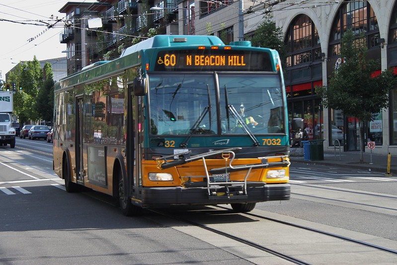
“KCM 7032 on Broadway” by SounderBruce is licensed under CC BY-SA 2.0.
This installment of the access-based route productivity series focuses on four routes that serve Seattle’s Capitol Hill neighborhood, but are otherwise quite varied. Three of these routes skirt downtown, but one passes through Capitol Hill on its way there. Two meet Metro’s definition of frequent, one runs less frequently but all day, and one is the rare example of a peak-only route not oriented around downtown. The variation continues in the positions of routes 8, 9, 11, and 60 within Metro’s ridership-oriented route productivity measurements, and my access-based ones.
| Route | Route Journeys (45 min) | Route | Route Journeys (30 min) | Route | Route Journeys (20 min) |
|---|---|---|---|---|---|
| E Line | 28,377,307,178 |
E Line | 6,292,756,511 |
E Line | 1,201,864,328 |
| 44 | 19,689,800,910 |
7 | 4,754,536,990 |
7 | 1,193,842,481 |
| 5 | 15,739,704,337 |
5 | 4,465,621,537 |
5 | 991,394,672 |
| 7 | 14,398,892,846 |
44 | 4,214,052,659 |
36 | 911,498,106 |
| 60 | 13,391,738,757 |
36 | 3,764,192,714 |
44 | 730,981,871 |
| 8 | 11,569,112,494 |
60 | 3,236,573,302 |
60 | 689,979,845 |
| 36 | 11,530,932,638 |
8 | 2,765,117,556 |
8 | 584,112,276 |
| 49 | 6,756,752,573 |
28 | 1,576,550,802 |
28 | 345,350,872 |
| 20 | 5,817,308,633 |
49 | 1,507,214,590 |
20 | 305,366,410 |
| 14 | 5,740,919,275 |
20 | 1,486,678,823 |
49 | 303,723,403 |
| 28 | 5,552,200,124 |
14 | 1,384,882,908 |
14 | 285,371,667 |
| 70 | 5,107,978,566 |
70 | 1,093,194,684 |
2 | 273,933,357 |
| 3 | 3,742,123,871 |
3 | 972,740,466 |
3 | 262,988,772 |
| 2 | 3,528,086,836 |
2 | 958,885,815 |
70 | 207,699,362 |
| 1 | 3,436,900,336 |
73 | 829,111,751 |
73 | 206,776,294 |
| 11 | 3,012,368,192 |
4 | 774,856,324 |
4 | 206,374,589 |
| 4 | 2,908,369,843 |
11 | 759,261,592 |
11 | 180,036,618 |
| 43 | 2,683,333,758 |
1 | 700,897,422 |
1 | 172,353,188 |
| 73 | 2,546,975,314 |
12 | 578,835,000 |
12 | 167,408,794 |
| 10 | 2,055,624,194 |
43 | 566,180,334 |
13 | 118,378,786 |
| 12 | 1,793,705,356 |
10 | 458,005,983 |
43 | 110,494,348 |
| 13 | 1,729,648,532 |
13 | 415,950,524 |
10 | 103,687,116 |
| 9 | 488,208,301 |
9 | 137,607,632 |
9 | 30,469,941 |
The Journeys per In-Service Second account for these routes having varying in-service time. Higher is better.
| Route | Journeys/In-Service Second (45 min) | Route | Journeys/In-Service Second (30 min) | Route | Journeys/In-Service Second (20 min) |
|---|---|---|---|---|---|
| 44 | 47,795 |
5 | 11,747 |
5 | 2,608 |
| 5 | 41,403 |
28 | 11,306 |
28 | 2,477 |
| 43 | 40,002 |
44 | 10,229 |
73 | 1,977 |
| 28 | 39,818 |
E Line | 8,767 |
44 | 1,774 |
| E Line | 39,533 |
43 | 8,440 |
36 | 1,751 |
| 8 | 31,080 |
73 | 7,928 |
E Line | 1,674 |
| 73 | 24,354 |
8 | 7,428 |
43 | 1,647 |
| 49 | 22,968 |
36 | 7,233 |
8 | 1,569 |
| 60 | 22,712 |
7 | 6,200 |
7 | 1,557 |
| 36 | 22,156 |
60 | 5,489 |
60 | 1,170 |
| 14 | 20,719 |
49 | 5,123 |
20 | 1,037 |
| 20 | 19,746 |
20 | 5,046 |
49 | 1,032 |
| 7 | 18,775 |
14 | 4,998 |
14 | 1,030 |
| 1 | 16,862 |
9 | 4,239 |
12 | 942 |
| 11 | 15,505 |
11 | 3,908 |
9 | 939 |
| 9 | 15,040 |
1 | 3,439 |
11 | 927 |
| 70 | 11,742 |
12 | 3,257 |
1 | 846 |
| 4 | 11,448 |
4 | 3,050 |
4 | 812 |
| 10 | 10,869 |
2 | 2,643 |
2 | 755 |
| 13 | 10,677 |
13 | 2,568 |
13 | 731 |
| 12 | 10,093 |
70 | 2,513 |
3 | 679 |
| 2 | 9,726 |
3 | 2,510 |
10 | 548 |
| 3 | 9,655 |
10 | 2,422 |
70 | 477 |
Replaceable Journeys are the number of journeys featuring a fastest path that includes the route, but still could be made within the time budget with that route eliminated. It can be made with a different combination of transit routes and walking. A lower number signifies higher performance, but, like the route journeys measurement, there is no accounting for the service investment. A route may have a lower number here not because it is inherently irreplaceable, but simply has fewer journeys to lose. Thus, I consider this to be another building block.
| Route | Replaceable Journeys (45 min) | Route | Replaceable Journeys (30 min) | Route | Replaceable Journeys (20 min) |
|---|---|---|---|---|---|
| 9 | 420,438,201 |
9 | 101,466,474 |
9 | 17,623,116 |
| 13 | 1,430,885,654 |
43 | 320,296,206 |
43 | 51,026,680 |
| 12 | 1,469,759,893 |
13 | 320,869,223 |
13 | 66,750,279 |
| 10 | 1,689,669,258 |
10 | 346,874,124 |
10 | 67,018,591 |
| 43 | 1,798,920,722 |
11 | 410,509,460 |
11 | 78,081,089 |
| 11 | 2,029,909,463 |
12 | 414,933,053 |
73 | 82,460,902 |
| 73 | 2,100,788,181 |
1 | 507,715,008 |
12 | 86,300,470 |
| 4 | 2,336,399,347 |
73 | 508,420,854 |
70 | 91,866,079 |
| 1 | 2,550,687,802 |
70 | 561,013,470 |
1 | 100,467,307 |
| 2 | 2,825,097,323 |
4 | 568,506,173 |
4 | 117,285,518 |
| 3 | 2,936,686,177 |
2 | 684,545,135 |
49 | 120,844,310 |
| 70 | 3,565,395,158 |
3 | 696,107,637 |
28 | 128,173,958 |
| 28 | 4,250,468,148 |
49 | 820,399,793 |
14 | 135,525,025 |
| 14 | 4,326,975,252 |
14 | 842,421,729 |
3 | 146,412,160 |
| 20 | 4,547,996,748 |
28 | 873,930,129 |
20 | 147,152,517 |
| 49 | 4,823,628,747 |
20 | 935,879,833 |
2 | 151,833,945 |
| 60 | 7,268,129,349 |
60 | 1,485,841,133 |
44 | 268,660,101 |
| 8 | 8,442,325,389 |
8 | 1,615,784,456 |
60 | 275,930,070 |
| 36 | 8,737,068,647 |
44 | 1,846,813,750 |
8 | 280,053,386 |
| 7 | 10,694,700,184 |
36 | 2,072,729,096 |
36 | 331,694,995 |
| 5 | 11,543,298,480 |
5 | 2,270,017,974 |
5 | 345,910,337 |
| 44 | 12,123,605,461 |
7 | 2,648,775,563 |
E Line | 416,531,786 |
| E Line | 17,553,294,642 |
E Line | 2,726,596,110 |
7 | 461,426,803 |
One way to account for the level of investment is to look at the replaceable journeys as a proportion of the route journeys. This is the Percent Replaceable. Lower is better.
| Route | % Replaceable (45 min) | Route | % Replaceable (30 min) | Route | % Replaceable (20 min) |
|---|---|---|---|---|---|
| 60 | 54.27% |
E Line | 43.33% |
E Line | 34.66% |
| 44 | 61.57% |
44 | 43.83% |
5 | 34.89% |
| E Line | 61.86% |
60 | 45.91% |
36 | 36.39% |
| 43 | 67.04% |
5 | 50.83% |
44 | 36.75% |
| 11 | 67.39% |
70 | 51.32% |
28 | 37.11% |
| 70 | 69.80% |
11 | 54.07% |
7 | 38.65% |
| 49 | 71.39% |
49 | 54.43% |
49 | 39.79% |
| 8 | 72.97% |
36 | 55.06% |
73 | 39.88% |
| 5 | 73.34% |
28 | 55.43% |
60 | 39.99% |
| 1 | 74.21% |
7 | 55.71% |
11 | 43.37% |
| 7 | 74.27% |
43 | 56.57% |
70 | 44.23% |
| 14 | 75.37% |
8 | 58.43% |
43 | 46.18% |
| 36 | 75.77% |
14 | 60.83% |
14 | 47.49% |
| 28 | 76.55% |
73 | 61.32% |
8 | 47.95% |
| 20 | 78.18% |
20 | 62.95% |
20 | 48.19% |
| 3 | 78.48% |
2 | 71.39% |
12 | 51.55% |
| 2 | 80.07% |
3 | 71.56% |
2 | 55.43% |
| 4 | 80.33% |
12 | 71.68% |
3 | 55.67% |
| 12 | 81.94% |
1 | 72.44% |
13 | 56.39% |
| 10 | 82.20% |
4 | 73.37% |
4 | 56.83% |
| 73 | 82.48% |
9 | 73.74% |
9 | 57.84% |
| 13 | 82.73% |
10 | 75.74% |
1 | 58.29% |
| 9 | 86.12% |
13 | 77.14% |
10 | 64.64% |
Another would be to simply look at the number of journeys that could not be replaced in proportion to in-service time, the Lost Journeys per In-Service Second.
| Route | Lost Journeys/In-Service Second (45 min) | Route | Lost Journeys/In-Service Second (30 min) | Route | Lost Journeys/In-Service Second (20 min) |
|---|---|---|---|---|---|
| 44 | 18,366 |
5 | 5,775 |
5 | 1,698 |
| E Line | 15,079 |
44 | 5,746 |
28 | 1,557 |
| 43 | 13,184 |
28 | 5,039 |
73 | 1,189 |
| 5 | 11,039 |
E Line | 4,968 |
44 | 1,122 |
| 60 | 10,386 |
43 | 3,666 |
36 | 1,114 |
| 28 | 9,335 |
36 | 3,250 |
E Line | 1,094 |
| 8 | 8,400 |
8 | 3,088 |
7 | 955 |
| 49 | 6,571 |
73 | 3,066 |
43 | 887 |
| 36 | 5,368 |
60 | 2,969 |
8 | 817 |
| 14 | 5,103 |
7 | 2,746 |
60 | 702 |
| 11 | 5,057 |
49 | 2,335 |
49 | 622 |
| 7 | 4,830 |
14 | 1,958 |
14 | 541 |
| 1 | 4,348 |
20 | 1,870 |
20 | 537 |
| 20 | 4,309 |
11 | 1,795 |
11 | 525 |
| 73 | 4,266 |
70 | 1,223 |
12 | 456 |
| 70 | 3,546 |
9 | 1,113 |
9 | 396 |
| 4 | 2,251 |
1 | 948 |
1 | 353 |
| 9 | 2,088 |
12 | 922 |
4 | 351 |
| 3 | 2,078 |
4 | 812 |
2 | 337 |
| 2 | 1,938 |
2 | 756 |
13 | 319 |
| 10 | 1,935 |
3 | 714 |
3 | 301 |
| 13 | 1,844 |
10 | 588 |
70 | 266 |
| 12 | 1,823 |
13 | 587 |
10 | 194 |
Routes 8, 11, and 60 have some high rankings for certain combinations of time budget and measurement, but all fall short of overall greatness. Route 9 never climbs above the mean.
Route 8
Route 8 has a reputation for being slow and unreliable. It doesn’t help that its number rhymes with the word “late.” Most of this slowdown occurs on Denny Way, where vehicle traffic queued for Interstate 5 ramps blocks the bus from proceeding. This notorious section has an outsized impact on the rest of the route, which stretches from Lower Queen Anne to Mount Baker Station, via South Lake Union, Capitol Hill, and the Central District.
In spite of its unreliability, this is a popular route. It’s King County Metro’s top route overall by rides per platform hour for the weekday peak. Outside of that, it ranks in the top 25% of all categories, other than passenger miles per platform mile on Saturdays and at off-peak times on weekdays. It does all this while never venturing into downtown Seattle.
I’d consider its journeys per in-service second and lost journeys per in-service second as average to good within this sample. They improve at higher budgets. Its percent replaceable is more on the average end, with the same degradation for shorter budgets. I see two competing factors as pushing it towards the average.
| Time Budget | Route 8 Journeys | % of All Journeys | Journeys/In-Service Second |
|---|---|---|---|
| 45 min | 11,569,112,494 |
2.8530% |
31,080 |
| 30 min | 2,765,117,556 |
1.8344% |
7,428 |
| 20 min | 584,112,276 |
1.0902% |
1,569 |
A slow route is at a disadvantage in all of these measurements. If a route falls below walking speed, it will lose journeys to just walking. Waiting in traffic also burns in-service hours while not delivering access. While the access measurement doesn’t model delay directly, route 8’s schedule reflects, at least partially, its plodding nature.
| Time Budget | Replaceable Journeys | % Replaceable | Lost Journeys/In-Service Second |
|---|---|---|---|
| 45 min | 8,442,325,389 |
72.97% |
8,400 |
| 30 min | 1,615,784,456 |
58.43% |
3,088 |
| 20 min | 280,053,386 |
47.95% |
817 |
A route that avoids downtown, though, is likely to have an advantage, as there is less competition along its path. In general, route 8 has minimal overlays. Only around Capitol Hill Station does it have an area of appreciable overlap, but this is in service of generating journeys through transfer opportunities.
Route 9
I can imagine route 9 as having once been a useful route. It directly connects Capitol Hill and the Rainier Valley. At one time, it was the only transit service on Broadway south of East Pike Street. It makes limited stops along Rainier Avenue South, allowing it to move faster than route 7 there.
These days, its existence is an unsettled one. It’s been among the first routes to get suspended when funding runs short, but never seems to go away permanently. In its most recent return, it’s been reduced to weekday-only service, with six northbound trips in the morning, and five southbound trips in the late afternoon. Those few trips aren’t getting a lot of love. Route 9 falls in the bottom 25% of all of Metro’s route productivity metrics.
| Time Budget | Route 9 Journeys | % of All Journeys | Journeys/In-Service Second |
|---|---|---|---|
| 45 min | 488,208,301 |
0.1204% |
15,040 |
| 30 min | 137,607,632 |
0.0913% |
4,239 |
| 20 min | 30,469,941 |
0.0569% |
939 |
The access-based measurements are cold towards it as well. It’s the worst route in the sample for 45-minute percent replaceable, and only climbs to third-worst for the other time budgets. By journeys per in-service second and lost journeys per in-service second, it creeps into the low end of the median.
| Time Budget | Replaceable Journeys | % Replaceable | Lost Journeys/In-Service Second |
|---|---|---|---|
| 45 min | 420,438,201 |
86.12% |
2,088 |
| 30 min | 101,466,474 |
73.74% |
1,113 |
| 20 min | 17,623,116 |
57.84% |
396 |
Today, route 9 is competing against itineraries that use combinations of the 1-Line, route 7, and the First Hill Streetcar. Its high percent replaceable indicates that these frequent routes would pick up the slack if it were to get cut again, and this time, stay that way.
Route 11
Of the routes in this installment, route 11 most resembles the conventional King County Metro route. It fits the mold of connecting Downtown Seattle to an outlying residential area, in this case, Madison Park. It differs from most of these in that it approaches downtown from the east, rather than north or south. This causes it to spend much less of its route there, comparatively. From a ridership standpoint, it only distinguishes itself in Saturday and Sunday rides per platform hour, where it is in the top 25%.
| Time Budget | Route 11 Journeys | % of All Journeys | Journeys/In-Service Second |
|---|---|---|---|
| 45 min | 3,012,368,192 |
0.7429% |
15,505 |
| 30 min | 759,261,592 |
0.5037% |
3,908 |
| 20 min | 180,036,618 |
0.3360% |
927 |
Similarly, it’s rather undistinguished in the access-based measurements, though it climbs to 5th overall in 45-minute percent replaceable. This discrepancy has been observed in other routes, and makes sense for route 11 too. It’s pretty much the only transit choice for getting to Madison Park, but that neighborhood is hemmed in by an arboretum and a private gated community to its west. This is presumably leading to a smaller walkshed for stops along that end of the route, but few alternatives for those within range of those stops. Further west on the route, it just misses a connection with the Capitol Hill Link station, and then shares its path downtown with several routes. In between, there are a few opportunities to transfer to north-south routes. This mix of positives and negatives yields middling performance overall.
| Time Budget | Replaceable Journeys | % Replaceable | Lost Journeys/In-Service Second |
|---|---|---|---|
| 45 min | 2,029,909,463 |
67.39% |
5,057 |
| 30 min | 410,509,460 |
54.07% |
1,795 |
| 20 min | 78,081,089 |
43.37% |
525 |
Route 60
Want to see a bunch of Seattle neighborhoods? Route 60 fits the bill. Capitol Hill, First Hill, Yesler Terrace, Little Saigon, North Beacon Hill, Georgetown, South Park, and White Center1: these are the places one passes as route 60 wends its way from Broadway to Seattle’s southern border. A lot of Metro bus routes look like copies of old streetcar lines, but not this one.
Route 60 is neither in the top or bottom 25% of Metro’s ridership measurements. It has received quite the service investment in recent years, so it has probably had some decent performance in years past. It didn’t meet Metro’s frequent service definition as late as March 2016, and it has 10-minute all-day weekday headways now.
| Time Budget | Route 60 Journeys | % of All Journeys | Journeys/In-Service Second |
|---|---|---|---|
| 45 min | 13,391,738,757 |
3.3025% |
22,712 |
| 30 min | 3,236,573,302 |
2.1472% |
5,489 |
| 20 min | 689,979,845 |
1.2879% |
1,170 |
On the access side, route 60 blows away the existing record for 45-minute percent replaceable. Its 54.27% figure comfortably tops route 44’s 61.57%. An access map for this time budget clarifies how it is doing this.
Unlike other exceptional performers, value is concentrated in a small portion of the route, in this case the South Park area. The other transit option in the neighborhood is the mostly half-hourly route 132. Route 60 and route 132 take parallel courses as they head north from South Park, but there are no opportunities to transfer between the corridors until route 132 gets a block away from the 1-Line at SODO station. Taking away this route would mean that a rider in South Park would go from having 10-minute service to many points in the south-central part of the city, to having to take a roundabout path with an infrequent component. This doesn’t just underscore the importance of route 60 here, but the paucity of east-west connections in South Seattle. The natural and built environments—a steep elevation change and Interstate 5—do not make this easy to fix, but Metro does not avail itself of every possible option.
| Time Budget | Replaceable Journeys | % Replaceable | Lost Journeys/In-Service Second |
|---|---|---|---|
| 45 min | 7,268,129,349 |
54.27% |
10,386 |
| 30 min | 1,485,841,133 |
45.91% |
2,969 |
| 20 min | 275,930,070 |
39.99% |
702 |
Ranking in percent replaceable drops off slightly at lower budgets, but remains strong among this sample. It’s more good than great in the other two measurements. In Beacon Hill, its path is shared with other routes, and, in First Hill, the introduction of the streetcar has probably cut its prevalence in journeys there. I would suspect its overall performance is carried by its southernmost section, and slightly weighed down by choices made about its route, and the network around it, elsewhere.
Thinking About the Results
This batch of routes set a new high, and a new low, for 45-minute percent replaceable, but no other combination of measurement and time budget. Route 60 grabs that high score while looking very different than other top routes. It is of great value to a relatively small area, rather than diffusing its access contributions over a wider one, as route 44 and the E Line do. Unlike those other routes, route 60 isn’t a universally strong performer across measurements. At this point, I’m not sure if these characteristics are related. I suspect that the reasons for route 9’s bottom-dwelling score are a little more prosaic. It is at best mediocre across measurements and budgets, which is likely a result of having many alternatives available.
On the whole, though, these routes aren’t terribly remarkable. Only route 9 makes a case for being superfluous, and it’s not a definitive one. From an access perspective, routes 8, 11, and 60 are solid, but unspectacular. They do their part in moving people throughout Seattle.
-
Technically in unincorporated King County. ↩︎