Last August, I presented a map that could quickly show sector-centered access. That is, when considering a single start point and a fixed time budget, how often can one reach all other points within a region, when starting at that point at every minute of the day. This prototype map used reachability data produced by an early version of arf and clumsily combined it with spatial information extracted from running the Access Analyzer. After working on disentangling arf from the Access Analyzer late last year, and focusing on arf’s performance in January, I wanted to spend February expanding its visualization capacities beyond the region-wide access maps shown in the last two posts. The first product of this work expands on the sector-centered approach seen in the August prototype.
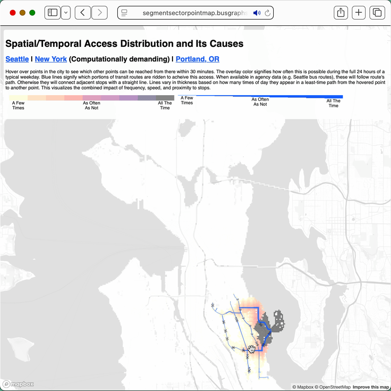
Like the prototype map, it uses a multi-color overlay to show at how many times of day one can start at the point under the cursor, and get to other points within the time budget. I am not aware of other access maps that use this exact approach. Typically, areas are considered reachable or not, with reachable parts shown with single-color polygon overlays. Reachability is based on whether the number of times a destination can be accessed within the time budget exceeds a threshold number.
In these other maps, a point that is reachable one fewer time than the threshold and a point that is never reachable look the same, even though the former is nearly as accessible as a point reachable at exactly the threshold number of times. In this map, there are 144 color values, so for a 1,440 minute day, each color corresponds to a change in ten starting times at which the destination is reachable from the origin. Even though the distinction between adjacent colors is subtle, which limits precision in practice, the multi-colored overlay allows a user to make some distinction beyond binary reachability, reflecting the realities of using fixed-route public transit.
This map expands on the prototype by displaying the transit service used to achieve the access. Segments of routes vary in thickness based on how many times of day riding that segment comprises part of at least one fastest-possible trip to any destination. Thicker lines are more likely to be useful for reaching arbitrary destinations, thin lines will rarely be used. I envision this feature as a way to facilitate conversations about transit network redesigns between transit agencies and riders. A proposal to cut parts of a route may be unpopular to those living in its vicinity. This map can help those in the neighborhood and those at the agency find common ground on whether the route segment is in fact critical for getting around.
As an example, transit service in Seattle’s Summit neighborhood has been repeatedly suspended and restored over the last fifteen years. Most recently, King County Metro restored it, in response to community feedback, as a looped section of route 3. This map shows that even for people living extremely close to it, more distant routes are many times more important for reaching destinations.
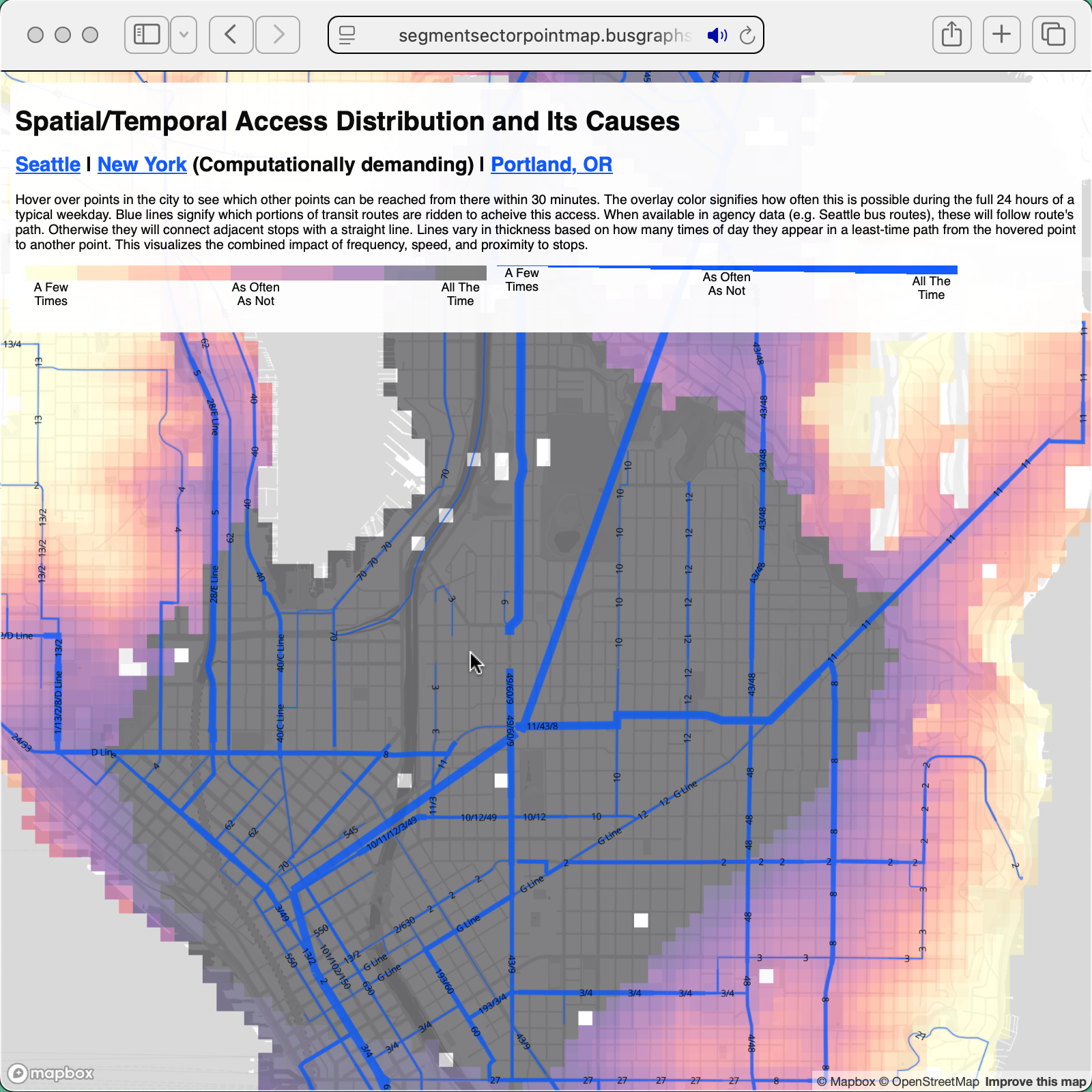
While this doesn’t mean that transit service here could never be beneficial, this map’s presentation of the access data should call into question Metro’s current execution.