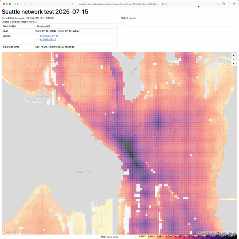
A network-wide access map colors sectors, uniform areas of a region, according to an access score. For an unweighted access measurement, the score corresponds to how often a rider originating in that sector can reach others throughout the region. But it doesn’t allow a transit rider with an interest in a specific sector to see exactly which destinations are within reach. The same data can generate a sector-centered access map that reveals this, so my maps allow transitioning between the network-wide and sector-centered modes. Unfortunately, it’s slow to the point of being unusable.
I hadn’t considered this a dealbreaker because I felt that network-wide maps were much more useful than sector-centered ones. As I have presented these maps and the philosophy behind them more widely, I’ve found that this preference is not shared.
Network-wide unweighted access maps are hard to interpret. The access score, both for the whole region and at the sector level, is expressed as a ratio that doesn’t map to something intuitive to a transit rider. When someone asks “what is a good access score?” I don’t have a satisfying answer. The flippant response is that 1 is a good score—it corresponds to the ability to reach any location in the region, within the time budget, at any time of day—and anything lower is less good. A sector-centered map is more interpretable, since sectors are colored according to how often in the day the destination can be reached from the center within the time budget. The scale can be labeled with plain language like “never”, “always”, and “more often than not”.
Even if network-wide access scores could be interpreted easily, they are misaligned with how most transit agencies, riders, and advocates think. My goal for public transit is that riders are never deprived of the opportunities available to users of other transportation modes. Determining sectors’ access scores is vital in this goal. While the score is specifically a measurement of how many other sectors one can get to, and how often one can get to them, within a single time budget, it is generally a measurement of the ability to get to many locations throughout the day within a reasonable amount of time, since a sector’s score is typically correlated across time budgets. In spite of my aspirations, routine trips from home to familiar, necessary destinations do comprise much of my transit use. Agency practices, and the preferences of transit advocates and riders, are focused on measurements of this kind of usage. While I would argue that this fixation undermines the wider adoption of public transit, it’s unreasonable to expect a rider not to care if they can no longer reach their job within 30 minutes should transit routes be restructured in the name of increasing network-wide access. This concern could be allayed by an access map that makes it easy to call up sector-centered views.
So I built a new way of computing and storing access maps.
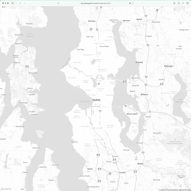
This prototype access map displays the same data as the previous one, but each sector’s access is available almost immediately. You can interact with the prototype, which visualizes a 30 minute time budget and King County Metro and Sound Transit schedules from July 7, 2025, here. I’m not sure how I’ll integrate this functionality into my existing access analysis workflows, nor am I confident that it will scale up to areas larger than Seattle, but this prototype feels like a promising first step toward presenting network-wide access without alienating the many public transit stakeholders whose goals differ from mine.