“Seattle hills” by chrisostermann is licensed under CC BY 2.0.
I’ve recently improved my access analysis software to adjust walking speed based on change in elevation. The use of a constant walking speed, regardless of terrain, in previous analyses opened them to legitimate criticism, especially in hilly Seattle. A walking model can now be selected when computing an access analysis. At this time, there are two options: the original constant-speed model, and one that attempts to characterize how an average person navigates changes in elevation. Obviously, this is not a complete solution to the problem of accurately modeling how people get around. After all, walking speed is affected by elevation change in different ways for different people, and, for some, walking is not how they get around at all. Allowing for any variation is merely the first step on a path toward the ability to model the experience of any transit rider.
Elevation data is provided by Mapzen’s Terrain Tiles. These are used to look up the elevations at both ends of the road and path segments that are extracted from OpenStreetMap using the Overpass API. With a resolution of 30 meters within the United States, the tiles don’t assess elevation with perfect accuracy, but they have a comparable scale to the 80 meter resolution at which I divide an area into sectors. I also assume that the change in elevation is continuous from one end of the segment to the other. This obviously isn’t true in all cases. Based on my experience with OpenStreetMap, though, most segments are fairly short, which limits how erroneous this is in practice.
In the new model, walking speed is adjusted for elevation using Tobler’s hiking function. This is an imperfect fit for navigating urban areas, but it’s a simple and longstanding way of approximating pace. It also matches the previous default walking speed of 1.4 meters per second (5 km/h) on flat ground. This means that elevation alone is driving the change in access, because the baseline walking speed is unchanged.
Tobler’s hiking function permits a maximum walking speed of 6 km/h when walking down a slight decline, but, under most circumstances, it indicates a slower walking speed than the previous default. Therefore, it’s unsurprising to learn that the number of origin destination pairs between which it is possible to walk in 30-minutes decreases.
| Walking Method | Completed Origin-Destinations Pairs (30 min) | Score Ratio | Map Link |
|---|---|---|---|
| Flat | 52,386,741 |
0.0497 |
link |
| Tobler | 42,100,012 |
0.0400 |
link |
| Percent Change | -19.5% |
link |
The greatest access decrease is observed at sector 11613, where there is a decrease of -0.0498 in mean score ratio. This is a steep path, which seems to be erroneously marked as open to the public in OpenStreetMap, from North Beacon Hill down to Interstate 5. Access to its neighbor, sector 11612, is diminished similarly. These are outliers, as the second’s decrease is a full 1.33 times less than that of the third—sector 12990 near Dr. Jose Rizal Park. In general, the areas with the largest decrease are in valleys adjacent to steep cliffs, as walking speed is reduced whether one is walking to or from the sector. The only two sectors with access increases under the new model—18084 and 12730—see single-sector increases in reachability, a difference so small to be essentially meaningless.
Changing the walking model also impacts the amount of access that can be delivered by transit, but it isn’t obvious whether the impact should be greater or less than the effect on walking alone. The utility of transit is diminished when it takes longer to reach stops, but transit can provide a faster way to climb hills, negating the walking speed penalty in some instances. Since the amount of transit service that King County Metro and Sound Transit provide throughout the day varies, it is necessary to count not just origin-destination pairs, but journeys—combinations of origin, destination, and time of day. Nevertheless, the percentage of the reduction can still be compared, even though the measured quantities differ by a couple of orders of magnitude.
| Walking Method | Completed Journeys (30 min) | Score Ratio | Map Link |
|---|---|---|---|
| Flat | 153,044,666,056 |
0.1009 |
link |
| Tobler | 129,808,782,708 |
0.0856 |
link |
| Percent Change | -15.2% |
link |
The lower percentage change indicates that transit blunts the impact of adjusting walking speed for hills, at least for Seattle’s present network and a 30-minute time budget.
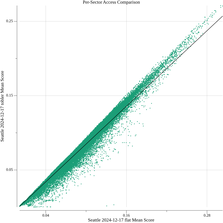
I wanted to investigate beyond these averages and some cherry-picked sectors, though. I constructed a scatterplot showing the relationship between each sector’s access under the two walking models.

The plot suggests that at the individual sector level, adjusting the access based on the average amount of reduction (indicated by the trend line) is a reasonable strategy. The correlation coefficient of 0.987 indicates a strong linear relationship.
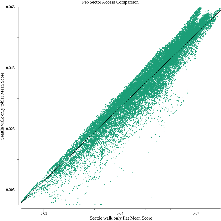
I plotted the same relationship for just walking as well.

The correlation is looser, but still strong, with a correlation coefficient of 0.968. Where there are noticeable outliers, they seem to match those present in the previous graph. The most extreme ones are the two sectors highlighted earlier. Transit service can’t do much to improve access down a steep, dead end path. I suspect many of the outliers shared by the two graphs have similar, but less extreme, characteristics.
The former plot does seem to pull away from the trend line as a sector’s score increases, more so than the latter does. To me, this indicates that sectors with exceptional access scores accrue their access more on the account of quality of transit service than on their walkshed alone. Therefore, they perform greater than the overall trend, since fewer paths to them involve significant walking. For a 30-minute time budget, which caps how exceptional a sector can be, the separation from the trend line is not particularly large. I suspect the deviation would increase for longer time budgets, at which point a linear approximation may no longer be applicable.
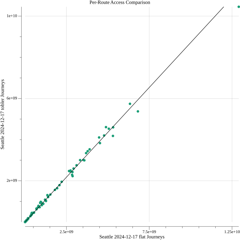
I also wanted to determine how much the access contribution of individual routes depends on accounting for elevation. Routes that help users get up steep hills could potentially be underrated by the flat walking model. Contrasting the access contributions of each route under the new model and the previous one does reveal some changes in the rankings of routes, indicating that the impact is not entirely even.

Nevertheless, reduction by a factor of 0.871 describes the relationship very well: the correlation coefficient is 0.997. A single route’s access contribution is more likely to be aligned with the average change than a single sector’s score is.
On the whole, being able to adjust walking speeds for elevation is important. It allays a concern that could cause people to justifiably distrust these analyses, and increases computing time only marginally. For measuring access for some average person in Seattle with a 30-minute time budget, though, it’s not particularly impactful. It may be interesting to know that the average access reduction is 15.2%, but this fact shouldn’t change how transit routes are planned. The effect is neatly modeled with a multiplicative reduction on both the sector and route levels. This means that it’s likely that changes showing positive impact under the flat walking model will still be beneficial when hilliness is considered.
Where this may provide new information is at the extremes. A walking model that doesn’t try to capture some average of human behavior, but that of a specific person who has limited mobility or vision, may describe a city where certain places are significantly harder to reach and certain bus routes are considerably more valuable. I’m glad that I now have the scaffolding in place to potentially do this. I also suspect that analyses with longer time budgets may reveal a point at which a linear approximation breaks down. For many of the analyses I’ve run up to this point, though—which, rightly or wrongly, reduced the walking behavior of all people to that of some average person—I still trust the conclusions that were drawn without accounting for elevation. It’s important to understand the limits of these analyses’ descriptive ability, but ignoring Seattle’s hills didn’t really hinder what they were seeking to achieve.